
Last updated: April 1, 2026. All 48 teams confirmed.
Every four years, football federations discover whether their logos actually work. These crests end up on sleeves, broadcast overlays, scoreboards, social avatars, merch tags. Shrunk to 20 pixels. Printed on scarves. Embroidered on caps. Most hold up. Some turn to mush.
I've been collecting these federation logos for years, and the 2026 lineup has some wild contrasts. You've got century-old heraldic shields sitting next to things that look like they came out of a Silicon Valley rebrand. Hand-drawn animals next to geometric abstractions. It's a mess, but an interesting one.
Here's every qualified nation's crest, organized by confederation.
Download all 48 logos: world-cup-2026-logos.zip (15 MB, PNG format, 1000×1000px)
Asia (AFC) — 9 teams
Australia National Football Team Logo

The kangaroo-and-emu combo is borrowed from the coat of arms, but the execution here feels sportier than governmental. Warm gold tones instead of formal heraldry. The football at center ties it to the sport without being lazy about it. Works well on kits, scales down cleanly.
The Socceroos qualified comfortably and will look to improve on their round-of-16 exit in Qatar. Tough group awaits, but they've proven they can compete.
Iran National Football Team Logo

The Asiatic cheetah is an endangered species native to Iran—a meaningful choice. The illustration is detailed but the solid background saves it from becoming noise at small sizes. Shape suggests a shield without committing to one. Smart restraint.
Team Melli were among the first to qualify and remain Asia's most consistent World Cup performers. Expect defensive discipline and set-piece danger.
Iraq National Football Team Logo

The Iraq Football Association crest is bold and modern—a black shield topped by a star, "IRAQ" in confident block letters, the national flag's red-white-black bands at center, and Arabic script below. The black outline gives it weight and authority. No clutter, no unnecessary symbols. It reads at any size, which is more than many crests manage.
The Lions of Mesopotamia earned their spot the hard way, beating Bolivia 2-1 in the inter-confederation playoff in Monterrey. First World Cup since 1986. Drawn with France and Norway in Group I—but they've already proven they belong.
Japan National Football Team Logo
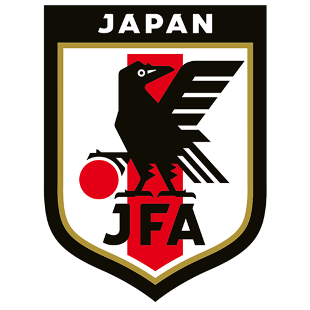
The Yatagarasu is a mythological crow that guided Japan's first emperor. Deep cut, but it works because the execution is sharp—black and white bird against that red stripe creates instant contrast. The shield shape is confident. One of Asia's best-designed crests.
The tournament's biggest dark horse. Japan beat Spain and Germany in Qatar, then ran a perfect qualification campaign—30 goals scored, only 3 conceded. They can hurt anyone.
Jordan National Football Team Logo

Safe and functional. The circular format is forgiving, the national colors are present, but there's nothing here that demands attention. For a debut nation, that might be fine—establish presence first, worry about brand identity later.
Historic first World Cup for Jordan after reaching the 2024 Asian Cup final. They're here to learn and enjoy the ride.
Qatar National Football Team Logo

The oryx abstraction is genuinely well-done. You can see the horns, the shape of the animal, but it's been reduced to clean geometry. Maroon is distinctive in international football. This feels like a modern sports brand, not a government seal.
The 2022 hosts and 2023 Asian Cup winners. Despite home advantage last time, they went out in the group stage. Need to prove they can compete away from Doha.
Saudi Arabia National Football Team Logo

Directly lifted from the national emblem, which limits creativity but guarantees recognition. The white-on-green contrast is strong and distinctive. Circular format is safe. It's not exciting design, but it's unmistakably Saudi.
Remember them beating Argentina in Qatar? That wasn't a fluke—the Green Falcons have quality. Aiming for the knockout rounds this time.
South Korea National Football Team Logo

This 2020 rebrand was bold. The tiger is Korea's symbolic animal, but rendered here as angular geometry rather than illustration. It's aggressive without being literal. The rectangular frame is unusual for football crests—stands out in a sea of shields and circles. Modern, confident, polarizing in the best way.
Ten consecutive World Cups and counting. Son Heung-min leads a talented generation. Qualified unbeaten and will be dangerous in any group.
Uzbekistan National Football Team Logo

There's a lot happening here—traditional patterns, national symbols, a football. The ambition is admirable but the execution gets cluttered. At small sizes, the detail becomes mud. A future simplification is inevitable if they want broadcast-friendly branding.
First World Cup ever for Uzbekistan. They've been close before but finally broke through. A feel-good story regardless of results.
Africa (CAF) — 10 teams
Algeria National Football Team Logo

The fennec fox is native to Algeria and cute as hell—good mascot choice. The shield format is traditional but the segmented green-and-white background adds visual interest. Balances national identity with sports energy reasonably well.
The 2019 AFCON champions are back. Missed Qatar 2022 but qualified as group winners this time. Expect fast, technical football.
Cape Verde National Football Team Logo

For a tiny nation's first World Cup badge, this is surprisingly competent. Clean lines, balanced composition, football integrated without being corny. Nothing groundbreaking, but nothing embarrassing either. Exactly what a debut should be.
Population under 600,000. First World Cup. One of the smallest nations ever to qualify. They're just happy to be here—and they should be.
DR Congo National Football Team Logo

The leopard is the national animal of the DRC, and FECOFA's crest gives it center stage above a football. Yellow shield with blue and red accents—vibrant, energetic, unmistakably Congolese. The badge has a presence that belies the country's modest football profile. Sometimes the best crests are the ones that let a single powerful symbol do the talking.
DR Congo defeated Jamaica 1-0 in the inter-confederation playoff to reach their first World Cup since 1974 (when they competed as Zaire). Drawn with Portugal, Uzbekistan, and Colombia in Group K. Les Léopards have nothing to lose and everything to prove.
Egypt National Football Team Logo

The eagle of Saladin is a pan-Arab symbol that Egypt has claimed most strongly. Green is unusual for a major football nation—stands out. The execution is straightforward heraldry. Not innovative, but the color choice alone makes it memorable.
Mo Salah's last World Cup? Probably. Egypt will be motivated to give their star the tournament run he deserves after the 2022 playoff heartbreak.
Ghana National Football Team Logo

The Black Star is Ghana's thing—it's on the flag, it's in the nickname, it's everywhere. Smart to let it dominate the crest rather than bury it in decoration. One strong symbol beats five weak ones. This badge understands that.
The Black Stars have World Cup pedigree—quarter-finals in 2010. Young squad rebuilding after a poor 2022. Dark horse potential if things click.
Ivory Coast National Football Team Logo

Orange is rare in international football, which gives Ivory Coast automatic differentiation. The elephant illustration is detailed but contained within the shield shape. You know exactly what country this is from across a stadium. That's the job done.
2024 AFCON champions on home soil. Confidence is high. A talented squad that could make some noise if they carry that form into the summer.
Morocco National Football Team Logo

Busy badge with a lot of elements competing for attention—Arabic text, French text, crown, star, stripes. It shouldn't work but the circular frame holds it together. The green-red combination is distinctively Moroccan. Chaos that somehow coheres.
The 2022 semi-finalists are legitimate contenders. 19-match winning streak, world-class defense, and the belief they can beat anyone. Drawn with Brazil—that group is chaos.
Senegal National Football Team Logo

The lion illustration has personality—there's movement and attitude in it. The tricolor background is busy but the colors are so saturated they work as a unit. The circular format contains the energy. A badge with genuine character.
2022 AFCON winners and round-of-16 finishers in Qatar. Sadio Mané's supporting cast has matured. Solid bet to advance from any group.
South Africa National Football Team Logo

Conceptually strong—football meets Africa, literally overlapping. The execution is clean and the gold-on-white Africa silhouette is elegant. More creative than most federation logos. The two-circle concept is memorable and scales well.
Bafana Bafana return after missing the last two World Cups. The 2010 hosts have rebuilt quietly. No pressure, no expectations—which might suit them.
Tunisia National Football Team Logo

Another eagle, another circular badge. The red-and-white palette is clean but common. Nothing wrong with it, nothing memorable about it either. Functional design that does the minimum required.
Six World Cups and counting. Held Denmark and drew with France in Qatar. Organized and hard to break down, but scoring goals remains a challenge.
North and Central America + Caribbean (CONCACAF) — 6 teams
Canada National Football Team Logo

The maple leaf is one of the most recognizable national symbols on Earth. Smart to make it dominant. The football integration at the bottom is subtle—present but not desperate. Red on white is as clean as it gets. Simple, confident, Canadian.
Co-hosts alongside USA and Mexico. Alphonso Davies leads a golden generation. Home advantage and high expectations—anything less than the knockout rounds would disappoint.
Curaçao National Football Team Logo

Basic shield, basic execution. For an island of 150,000 people making their first World Cup, nobody expected a design masterpiece. It's identifiable and inoffensive. That's enough for now.
Population 150,000. First World Cup. The smallest Caribbean nation ever to qualify. A genuine underdog story.
Haiti National Football Team Logo

The coat of arms is historically significant but graphically complex. At small sizes, the detail disappears into blue-and-red mush. The colors save it—strong contrast, immediate recognition. Sometimes national symbolism trumps design optimization.
Back after 50 years. Haiti last appeared in 1974. This squad has fought through adversity to get here—the football will be emotional.
Mexico National Football Team Logo

A brave redesign that abandoned the traditional coat-of-arms eagle for something fiercer and more abstract. The geometric wings give it motion. The green is saturated and confident. Polarized fans initially but it's aged well—feels contemporary without losing Mexican identity.
Co-hosts. Desperate to break the round-of-16 curse that's haunted them for seven straight World Cups. Home soil might finally be the difference.
Panama National Football Team Logo

Standard federation template—shield, stars, national colors, done. Red, white, and blue is the most crowded palette in international football. Nothing here differentiates Panama from a dozen other nations. Functional but forgettable.
Third World Cup after 2018. Roman Torres and the original generation have passed the torch. New faces, same grit. Will fight for every point.
United States National Football Team Logo

The 2016 rebrand stripped everything back—no stars, no ball, no fuss. Just "USA" and stripes. It was controversial because Americans love their stars and eagles, but the minimalism has merit. Scales perfectly. Reads instantly. Whether it has enough soul is a different question.
Co-hosts with sky-high expectations. Christian Pulisic leads a talented young core. Anything less than a deep run would be considered failure. The pressure is real.
South America (CONMEBOL) — 6 teams
Argentina National Football Team Logo

The "AFA" monogram is elegant typography that's become iconic through repetition. The gold treatment adds prestige without being gaudy. Laurel wreaths are classical but contextually appropriate for a federation founded in 1893. Timeless because it never tried to be trendy.
Defending champions. Messi's last World Cup at 38. The supporting cast (Álvarez, Mac Allister, Fernández) has proven they can win without him. Still among the favorites.
Brazil National Football Team Logo

Instantly recognizable from across any stadium. The yellow-green-blue combination is owned by Brazil in a way few nations own their colors. The shield shape is traditional but the color blocking is bold. Five World Cups justify the confidence in this design.
Haven't won since 2002. Struggled through qualifying by their standards. But Brazil in a World Cup is always dangerous—the name alone carries weight. Drawn with Morocco in a brutal group.
Colombia National Football Team Logo

Yellow dominance matches their famous home kit—there's brand consistency here. The execution is professional if unremarkable. The tricolor is busy but the heavy yellow weighting creates a focal point. Does what it needs to do.
Back after missing Qatar 2022. James Rodríguez still pulls strings, but the squad is deeper now. Could be this generation's last shot at glory.
Ecuador National Football Team Logo

The Andean condor is a strong symbol—largest flying bird in the Western Hemisphere. The illustration is detailed, maybe too detailed for modern digital applications. Blue and yellow pop nicely together. Traditional approach that could benefit from simplification.
Reached the knockout rounds in Qatar with one of the youngest squads. Those players are now in their prime. Dark horse potential if Moisés Caicedo stays fit.
Paraguay National Football Team Logo
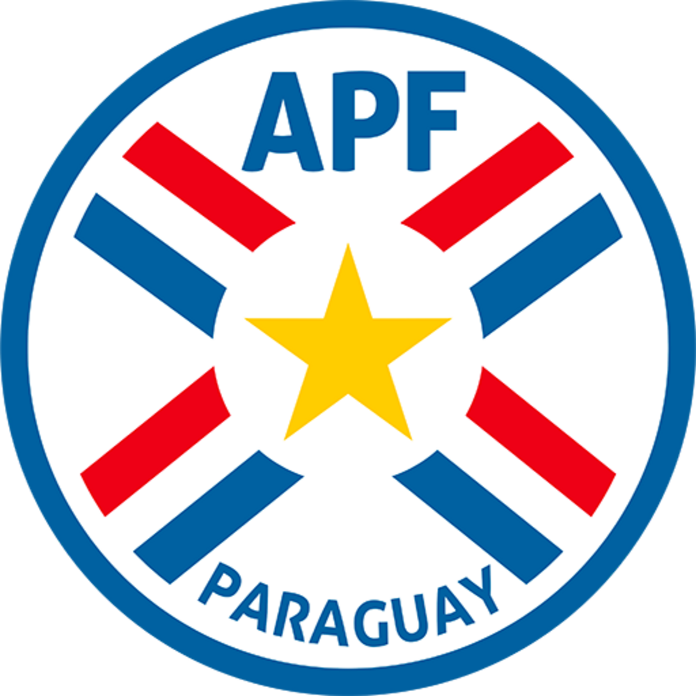
Circular format, clean typography, national colors present. It's a logo that exists. Nothing offensive, nothing inspired. The kind of design that gets approved by committee because nobody objects strongly enough.
Return after missing 2022. The golden generation is gone, but Paraguayan football always produces fighters. Won't roll over for anyone.
Uruguay National Football Team Logo

The Sol de Mayo (Sun of May) is shared with Argentina but Uruguay owns it on the football pitch. Four stars above for four major titles. The sky blue is softer than most national colors—distinctively Uruguayan. History and identity compressed into a clean mark.
Two-time champions still punching above their weight. Núñez and Valverde lead a new generation. Underestimate them at your peril—they always show up.
Oceania (OFC) — 1 team
New Zealand National Football Team Logo

The silver fern is New Zealand's calling card across all sports. Using just the outline—no fill, no embellishment—takes confidence. Black and white is about as minimal as you can get. When your symbol is this strong, decoration is just noise. Perfect restraint.
The All Whites are back after missing 2022. Chris Wood leads the line. Realistically they're here to compete, not contend—but they'll make life difficult for group opponents.
Europe (UEFA) — 16 teams
Austria National Football Team Logo

The Austrian eagle is a classic heraldic symbol executed traditionally. Red and white is simple but Austria hasn't overthought it. Sometimes a straightforward approach ages better than trying to be clever. Dignified rather than exciting.
Dark horses under Ralf Rangnick. High-pressing, aggressive football. Reached the Euro 2024 knockouts and have only improved. Don't sleep on them.
Belgium National Football Team Logo

The lion is Belgium's symbol but it's almost an afterthought here—the "RBFA" text dominates. Red and yellow is a distinctive combination that matches the flag. The round format works digitally. Professional but not particularly memorable.
The golden generation's last dance. De Bruyne, Lukaku, Courtois—now or never. Third place in 2018 is still their best result. Time is running out.
Bosnia and Herzegovina National Football Team Logo

The country's map silhouette centered on a stylized football—it's a clever concept that ties geography to sport. Blue and yellow dominates, matching the national flag. The bilingual text (Bosnian and Cyrillic) reflects the federation's dual-script reality. A circular badge for a young nation that's still building its football identity, and doing it with confidence.
The story of the playoffs. Bosnia eliminated Italy on penalties in the Path A final—arguably the biggest upset of the entire qualification campaign. Drawn with Canada, Qatar, and Switzerland in Group B.
Croatia National Football Team Logo

The šahovnica (checkerboard) is so distinctively Croatian that it carries the entire badge. You could show someone a red-and-white checkered fragment and they'd say "Croatia." That's rare brand equity. The blue stripe and gold football are almost unnecessary—the pattern does all the work.
2018 finalists, 2022 third place. Modrić is 40 but still running games. The supporting cast has stepped up. Never count them out.
Czechia National Football Team Logo

The Bohemian lion rampant is centuries-old heraldry given a modern treatment. The 2021 rebrand simplified the shape while keeping the lion fierce and recognizable. Red, blue, and white work in crisp contrast. The "FAČR" lettering is clean and contemporary. One of the better recent European federation redesigns.
Czechia scraped through on penalties twice—against Ireland in the semis and Denmark in the Path D final. Gritty qualification for a nation with strong World Cup pedigree. Drawn with Mexico, South Africa, and South Korea in Group A.
England National Football Team Logo

The Three Lions have represented England since the 12th century. That's 800+ years of brand equity. The Tudor roses add English specificity. The heraldic execution is premium—navy, gold, red, white working in harmony. One of football's genuinely iconic crests.
Euro 2024 finalists. Betting favorites alongside Spain and France. Bellingham, Saka, Foden—the talent is there. The question is always the same: can they deliver when it matters?
France National Football Team Logo

Stripping away the shield was a bold choice that paid off. Just the rooster, no frame, no background. The silver-navy gradient is sophisticated. It's a mark that works as a standalone icon—you could put this on anything and it reads as French football. Modern classic.
2018 champions, 2022 finalists. Mbappé is the best player in the world. Four finals in seven tournaments tells you everything. Always the team to beat.
Germany National Football Team Logo

The circular format with text around the edge has a premium, institutional feel. The eagle is stylized enough to feel modern while remaining clearly an eagle. All-gold treatment is confident. This says "serious football nation" without shouting.
Group stage exits in 2018 and 2022 stung. Euro 2024 at home helped rebuild confidence. Musiala and Wirtz are the future. Redemption arc incoming?
Netherlands National Football Team Logo

Orange is the Netherlands' superpower—no other major football nation owns a color so completely. The lion rampant is classic heraldry executed cleanly. White on orange has perfect contrast. Simple, distinctive, unmistakably Dutch.
Perennial underachievers? Maybe. But this squad has balance—experience and youth, defense and attack. Quarter-finals minimum is the expectation.
Norway National Football Team Logo

The lion with an axe comes from Norway's coat of arms—there's historical weight here. Red dominance is bold and energetic. Traditional heraldic approach but the axe-wielding lion has genuine personality. Memorable without being flashy.
First World Cup since 1998. Haaland finally gets his tournament. Drawn with France in what might be the group of death. Survive that and anything's possible.
Portugal National Football Team Logo

The Cross of Christ shape is unique in football crests—instantly recognizable silhouette. The quinas (five shields) reference Portugal's founding legend. Red and gold is a premium palette. This badge has layers of meaning that reward closer inspection while still working at a glance.
Ronaldo at 41? If he's there, he'll be a factor. But Portugal's depth is real—Bruno, Leão, Dias. Semi-final ceiling, maybe higher.
Scotland National Football Team Logo

The lion rampant is Scotland's royal symbol—heavy historical significance. Blue and yellow is a clean combination that stands apart from England's palette (probably intentional). Traditional heraldic execution without modern flourishes. Classic approach for a classic footballing nation.
Tartan Army travels in force. Drew Brazil in their group. Tough road ahead but the fans will make it a party regardless of results.
Spain National Football Team Logo
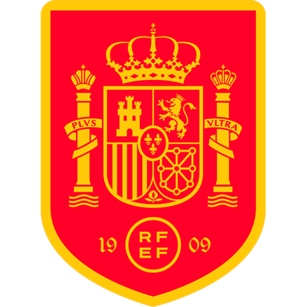
Maximum information density—crown, coat of arms, RFEF emblem, founding date. It's a lot. But the red-yellow color blocking is so strong it holds everything together. The royal crown adds prestige. Busy but regal, like Spain's style of play.
Euro 2024 champions. Betting favorites. Pedri, Gavi, Yamal—the midfield production line continues. Tiki-taka evolved. Legitimate title contenders.
Sweden National Football Team Logo
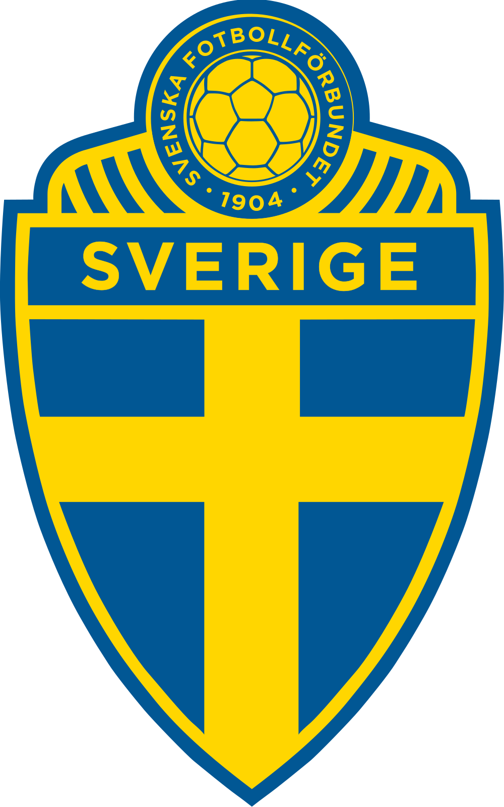
Three crowns on a blue cross against yellow—Sweden's national colors are unmistakable. The Tre Kronor symbol predates the football federation by centuries. Yellow and blue is one of the strongest color combinations in international football, rivaling the Netherlands' orange for instant recognition. Classic Scandinavian design: no fuss, maximum impact.
Sweden beat Poland in the Path B final to return to the World Cup after missing Qatar 2022. A post-Ibrahimović rebuild has produced a balanced, hard-working squad. Drawn with Netherlands, Japan, and Tunisia in Group F—a group where every match is a toss-up.
Switzerland National Football Team Logo

No Swiss cross? Bold choice. The running footballer integrated with typography is unique among national team logos—nobody else has tried this. It's more "sports brand" than "national federation." Divisive design that at least dares to be different.
Consistent round-of-16 performers. Beat France on penalties in Euro 2020. Won't win it, but they'll make someone's life miserable.
Türkiye National Football Team Logo

The crescent and star is Türkiye's defining symbol, and the national team badge strips it down to pure essence—white on red, circular frame, nothing else. No text, no football, no founding year. Just the symbol. It's the kind of confidence that comes from having one of the most recognizable emblems on Earth. You see this once and remember it.
Türkiye beat Kosovo in the Path C final after a strong Euro 2024 showing. Young talents like Arda Güler and Kenan Yıldız have arrived. Drawn with USA, Paraguay, and Australia in Group D—a group they'll fancy their chances in.
Patterns I keep noticing
With all 48 crests now finalized, clear patterns emerge. Half these crests have animals. Eagles, lions, kangaroos, elephants, tigers, roosters. Execution quality varies. The best animal crests (England's Three Lions, Netherlands' lion) commit to a style and execute it cleanly. The worst ones try to cram too much detail into the illustration.
There's a generational split between heraldry and modernism. Old federations (England, Brazil, Argentina) have crests with decades of meaning baked in. Recent redesigns (South Korea's tiger, Mexico's eagle, USA's stripes) chase geometric simplification. Neither approach is automatically better.
The federations with the strongest identities own a specific color. Netherlands owns orange. Brazil owns yellow-green. Japan owns that particular blue. Federations stuck with generic red-white-blue have to work harder on shape differentiation.
The Full 48
For the first time, 48 nations will compete at a World Cup. The expansion brought debut nations (Jordan, Uzbekistan, Cape Verde, Curaçao), dramatic comebacks (Haiti after 50 years, DR Congo after 52, Iraq after 40), and one of the great qualifying upsets when Bosnia knocked out Italy on penalties.
The crests tell the story. You've got century-old heraldic traditions sitting next to federation logos younger than most players wearing them. Animals dominate—lions, eagles, leopards, roosters, kangaroos—but the execution gap between the best and worst is enormous. The best crests (England, Japan, Netherlands) commit fully to a concept. The forgettable ones try to please everyone.
June 11 can't come fast enough.