Liga Profesional de Fútbol (LPF) is the organization that runs Argentina's top-flight domestic football league—home to legendary clubs like Boca Juniors, River Plate, Racing, Independiente, and San Lorenzo. For the 2026 season, the league unveiled a completely reimagined brand identity that makes a bold statement: the fan is now the logo.
Gone is the traditional crest-and-monogram approach that dominated the previous identity. In its place: a silhouette of a supporter waving a flag, rendered in Argentina's iconic light blue and white. It's a dramatic philosophical shift—from institutional authority to populist energy—and it's already sparking passionate debate among Argentine football fans.
Before and After

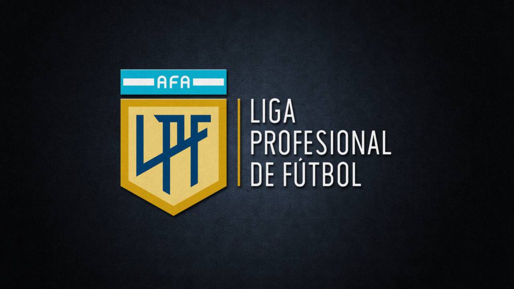
The previous mark followed the classic sports-federation playbook: a formal shield in gold and teal, an "LPF" monogram at the center, the AFA (Argentine Football Association) bar positioned above to signal hierarchy, and the full league name spelled out alongside. It communicated tradition, authority, and institutional permanence—the visual language of trophies, official documents, and ceremonial occasions.

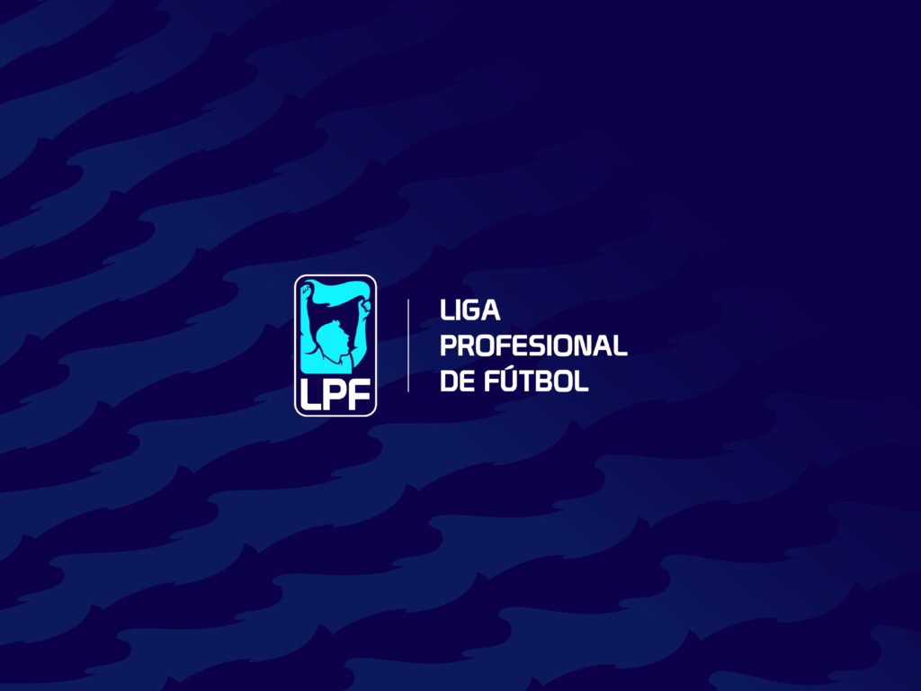
The new mark abandons that framework entirely. A simplified human silhouette—arm raised, flag waving—sits inside a rounded rectangle. The "LPF" initials appear below in a squared, modern typeface. The palette shifts to Argentina's national colors: light blue, white, and touches of deeper blue. The full league name can appear alongside, but the symbol is designed to stand alone.
This isn't a modernization of the old crest. It's a complete narrative pivot. The league's identity is no longer a badge of authority—it's a representation of the people who fill the stadiums every weekend.
The Symbol: When the Fan Becomes the Brand
The most significant change is conceptual, not aesthetic. The old identity leaned on hierarchy and formality: the AFA bar establishing federation credentials, the shield implying heritage, the monogram suggesting exclusivity. It was a logo designed to look good on letterhead and trophy presentations.
The new identity leans on culture and emotion. A simplified silhouette of a supporter waving a flag—an explicit reference to Argentina's legendary hinchada culture—positions the fan as the emotional protagonist of the entire league. Every weekend, Argentine stadiums become seas of flags, banners, and coordinated choreography. This logo says: that energy is what defines us.
The strategic implications are significant:
- More relatable. The symbol is a person, not an institutional crest. It invites identification rather than demanding respect.
- More broadcastable. The simplified silhouette reads instantly on screen, in motion graphics, and at small sizes where detailed crests become illegible blobs.
- More emotional. You can feel something when you look at it—memory, belonging, passion. Crests rarely trigger that response.
- More polarizing. Whenever you depict a human figure, you invite immediate taste debates. Some will love it; others will call it childish or reductive.
Shifting from "institution" to "people" is a powerful move in sports branding. But it trades timelessness for immediacy. Crests can last a century without feeling dated. Human silhouettes are more vulnerable to looking like a specific moment in design history.
Color: Anchoring in National Identity
The palette shift is arguably as important as the symbol change. The previous gold-and-teal combination felt league-specific—distinctive, but disconnected from broader Argentine identity. You wouldn't immediately associate those colors with the country.
The new palette moves decisively toward Argentina's national colors: the light blue (celeste), white, and deeper blue accents that every Argentine recognizes from the national team, the flag, and a century of sporting iconography.
This anchoring serves multiple purposes:
- Instant national recognition. In international broadcast contexts, the league immediately reads as "Argentina" without needing explanatory text.
- Emotional resonance. These colors carry enormous weight for Argentine fans—World Cup victories, Maradona, Messi, generational memories.
- System flexibility. The blue-and-white foundation provides a neutral base that won't clash with individual club colors in co-branded applications.
The trade-off: the league loses some visual distinctiveness. The old gold-and-teal was unusual enough to be memorable on its own terms. The new palette is more meaningful but less unique.
Typography: Squared, Technical, Modern
The identity introduces a squared, techno-leaning typeface for titles and headings. It's a common choice in contemporary sports branding—La Liga, various esports leagues, and broadcast-heavy properties have moved in similar directions.
The logic is practical: squared letterforms are confident, modular, and highly legible in the contexts where sports brands live today. Broadcast graphics. Social media templates. Matchday posters. Stadium LED boards. App interfaces. These applications favor bold, geometric type that holds up under compression and motion.
The "LPF" emblem can also function in a simplified stamp form—just the fan silhouette and initials, without the full league name. This flexibility matters for small placements: favicons, social avatars, kit patches, corner badges on broadcast graphics. The old crest would have become an unreadable smudge at those sizes.
Why This Will Divide Opinion
Rebrands in football always trigger debate. But this one is especially combustible because it changes the fundamental role of the league's visual identity.
A crest communicates: tradition, authority, permanence, official seal. It says the league is an institution that transcends any individual moment. It's the visual language of heritage.
A fan silhouette communicates: identity, energy, belonging, movement. It says the league is its people—alive, passionate, present tense. It's the visual language of culture.
Neither approach is objectively correct. They're different answers to the question: what is a football league, fundamentally? Is it an institution that organizes competition? Or is it a cultural phenomenon that exists because fans show up?
The arguments will break down predictably:
- In favor: Clearer emotional story. More modern and flexible system. Better suited to digital and broadcast contexts. Celebrates what makes Argentine football unique.
- Against: Less classic and timeless. Loses the gravitas of an "official seal." More dependent on flawless execution across applications. Risks looking dated in a decade.
Argentine football fans are not known for quiet, measured opinions. Expect the discourse to be loud.
The Real Test: System Execution
A logo reveal is just the headline. The actual verdict on this rebrand will come from the system—how the identity performs across every touchpoint where the league appears.
The critical applications to watch:
- Broadcast packages. Does the motion design bring the fan silhouette to life, or does it feel static and awkward?
- Match graphics. How does the identity coexist with club crests, sponsor logos, and score overlays?
- Kit patches. Does the simplified emblem work at embroidery scale on player jerseys?
- Sponsor integration. Can the system accommodate commercial partners without visual chaos?
- Club coordination. Can the league maintain consistency across dozens of clubs and media partners, each with their own brand priorities?
If the execution is tight and consistent, this will read as a confident modernization that positions the league for a new era. If the applications are inconsistent or the symbol doesn't animate well, critics will point to the logo and say they told you so.
The flag is raised. Now the league has to wave it.


