Honda is unveiling a refreshed version of its iconic H emblem—and design enthusiasts will appreciate the thoughtful evolution at play here. The updated logo, set for full rollout in 2027, marks Honda's first major badge redesign since 2001.

What's Changed?
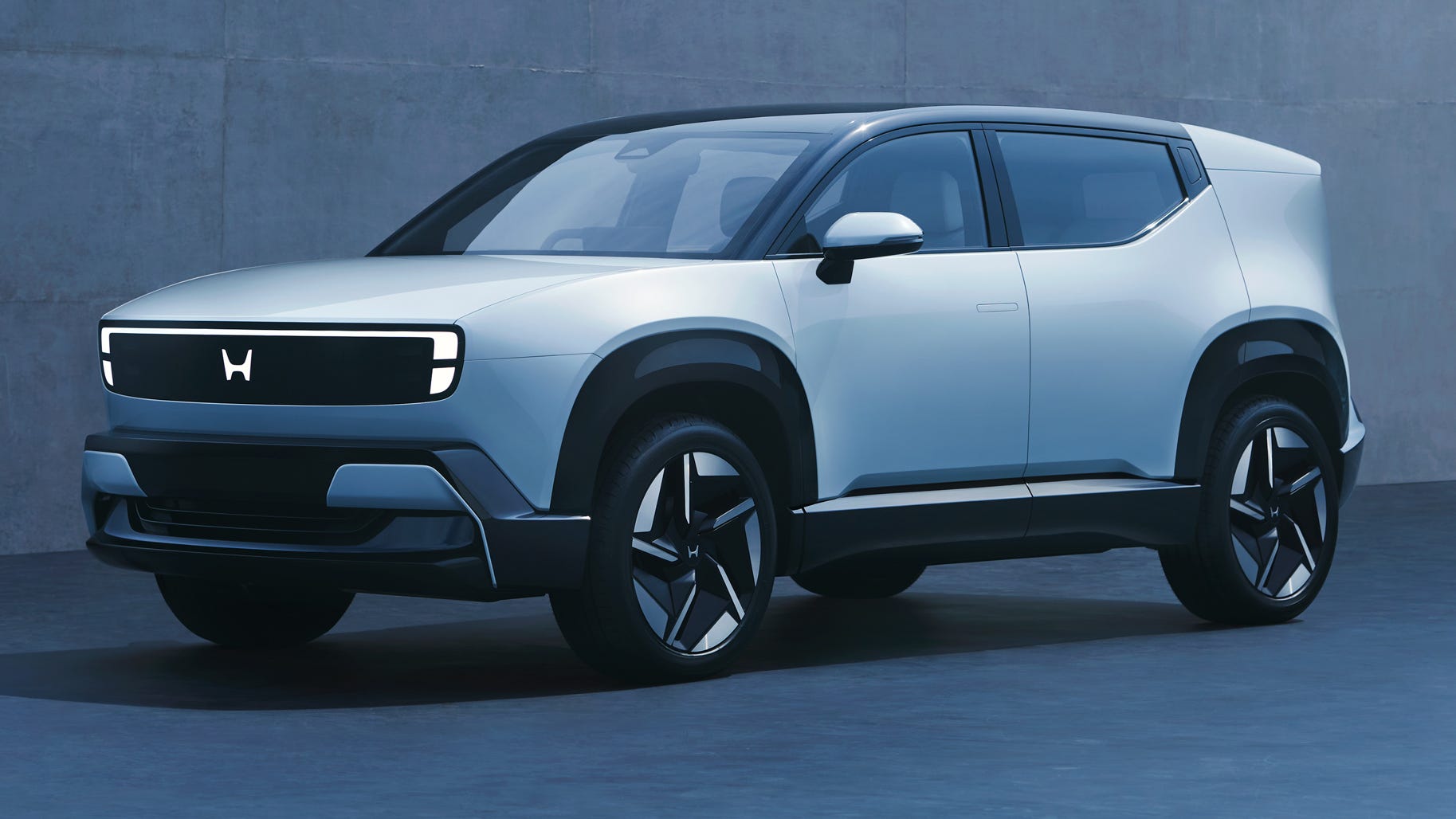
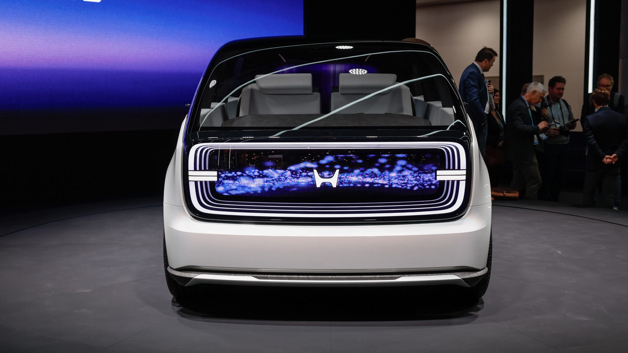
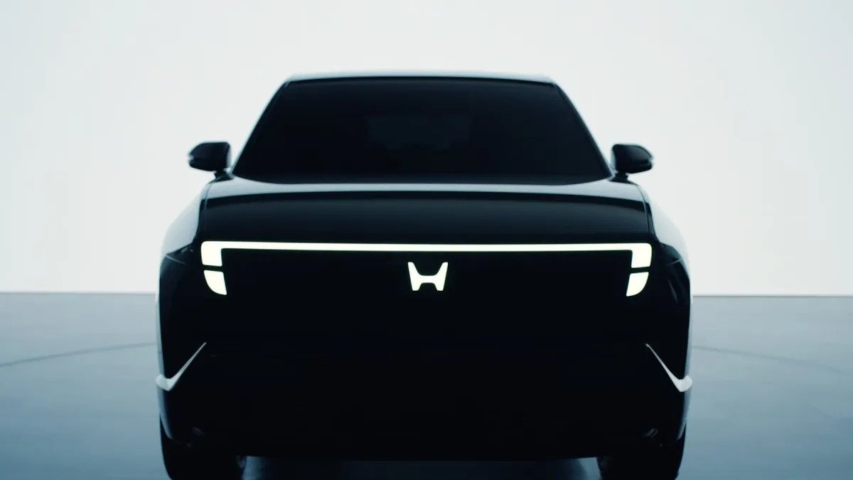
The new H mark takes a more minimalist approach. It's wider, with taller and more separated upper prongs that create a cleaner, more open silhouette. Honda describes the design as representing "two outstretched hands"—a fitting metaphor for a brand positioning itself toward transformation and advancement.

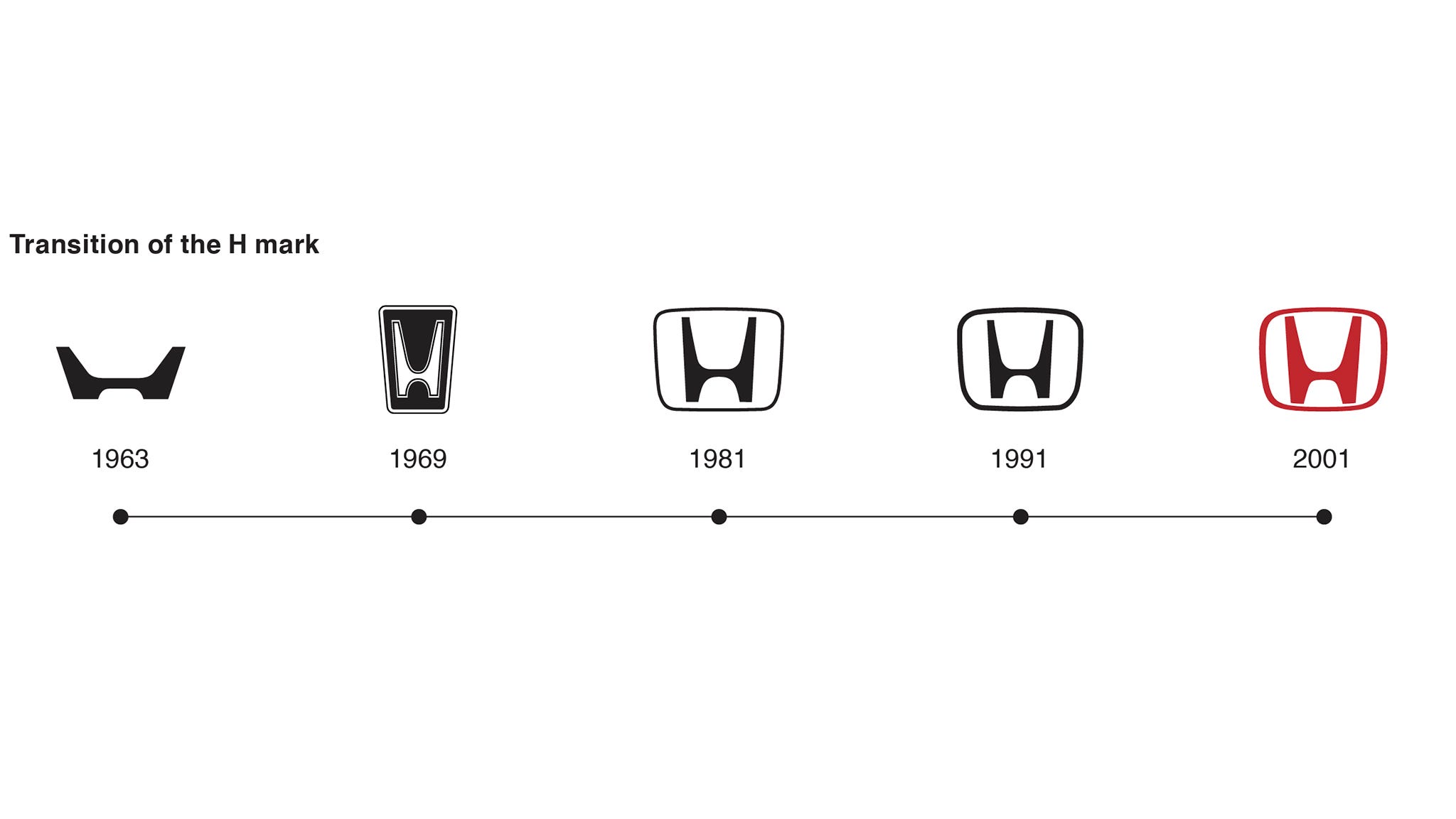
What makes this redesign particularly interesting is its historical callback. The updated proportions closely echo Honda's original 1963 H mark, bringing the brand's visual identity full circle after six decades of evolution.
A Brief Logo Timeline
- 1963: The original H mark debuts
- 1981: Honda introduces the surrounded design, inspired by the shamisen (an ancient Japanese stringed instrument)
- 2001: Current logo revision takes hold
- 2027: The new minimalist H begins its rollout
First Appearance
The refreshed badge made its debut on Honda's 0 Series electric vehicle family before expanding to all new models. Beyond vehicles, expect to see it across dealerships, motorsport applications, and corporate communications.


Part of a Larger Trend
Honda joins a growing list of automakers rethinking their visual identity. Kia's angular rebrand, Buick's streamlined tri-shield, Porsche's refined crest, and Range Rover's simplified wordmark all reflect a broader industry shift toward cleaner, more adaptable logos suited for digital displays and minimalist design language.
The timing aligns with Honda's introduction of new hybrid platforms and powertrains—making this more than a cosmetic update. It's a visual signal of the brand's next chapter.


