Super Bowl logos used to reinvent themselves completely year after year—each host city bringing a wildly different visual approach to the biggest event in American sports. That era is over. Since the mid-2010s, the NFL has embraced what designers call a "template era": a consistent framework built around the Lombardi Trophy, bold Roman numerals, and host-city storytelling baked into the letterforms themselves.
Super Bowl LX—the 2026 game hosted in the San Francisco Bay Area—might be the most colorful, most locally specific, and most visually ambitious version of that system we've seen yet. It's a logo that functions simultaneously as an official sports badge and a love letter to Northern California.
The Mark: Super Bowl LX

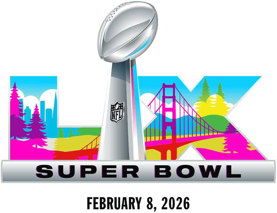
The composition follows the established modern Super Bowl formula: the Lombardi Trophy anchors the center, a metallic "SUPER BOWL" bar grounds the bottom, and the Roman numerals "LX" flank the trophy on either side. What makes this version stand out is what happens inside those numerals.
The "L" and "X" become canvases for a vivid Bay Area panorama: the unmistakable silhouette of the Golden Gate Bridge, the San Francisco skyline with its distinctive towers, rolling hills, and towering redwood trees—all rendered in a high-saturation, multi-color palette that feels more like a festival poster than a traditional sports identity.
The color choices are deliberate and bold. Deep ocean blues anchor the composition, while sunset pinks, forest greens, golden yellows, and warm reds create layers of visual interest. It's a palette that captures Northern California's famous light—those magic-hour moments when the fog rolls through the Golden Gate and everything glows.
Evolution Within Constraints
If you've watched Super Bowl identities evolve over recent years, you recognize the underlying structure. The NFL has committed to a repeatable system where the host city or region shows up inside the Roman numerals while everything else remains consistent. It's a smart approach for a brand that needs to feel both timeless and fresh every single year.
What changes from year to year is the density and attitude of the illustration work. And LX pushes both further than we've seen before:
- Illustration over ornament. Previous years have used patterns, textures, and abstract motifs. LX commits to recognizable scenery—actual landmarks you can point to on a map.
- Maximum color saturation. Blues, pinks, greens, yellows, and reds all coexist in a single mark. It's aggressive by sports logo standards, but it works because the composition is so tightly controlled.
- Instant geographic read. Even without any text, even at thumbnail size, that bridge silhouette does enormous identity work. You know exactly where this game is happening at a glance.
When a brand system is this standardized, the only way to make each year feel special is to push the local storytelling harder. LX understands that assignment.
Comparison: Super Bowl LIX (2025)
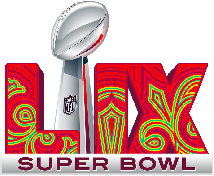
To understand why LX feels so visually loud, it helps to compare it directly to the previous year's mark. Super Bowl LIX—the 2025 game in New Orleans—took a notably different approach to the same template.

LIX leaned into New Orleans with a Mardi Gras-inspired pattern inside the numerals—more abstract, more decorative, and less literal than LX's scenery-based approach. The colors evoke the French Quarter and carnival season, but through texture and motif rather than recognizable landmarks.
Same architecture. Same trophy placement. Same structural logic. Totally different vibe.
LIX reads like texture—you feel the celebration without seeing specific places. LX reads like place—you're looking at an actual postcard of the Bay Area compressed into two letterforms. Neither approach is objectively better; they're just different tools for the same job. But the contrast shows how much flexibility exists within what seems like a rigid system.
Why This Works
Super Bowl branding has to accomplish two jobs simultaneously. It needs to feel "official"—carrying the gravitas of the NFL's biggest stage, the weight of decades of tradition, the seriousness of a championship event. And it needs to feel "new"—this year's host, this year's hype, this year's reason to pay attention.
The trophy-and-numerals template guarantees the first job gets done. The Lombardi Trophy is one of the most recognizable objects in American sports, and its central placement signals importance before you process anything else.
LX earns the second job by transforming the numerals into a vivid travel postcard. It's not just a logo—it's an invitation to experience the Bay Area through the lens of football's biggest weekend.
From a practical standpoint, the design checks every box a modern event identity needs to hit:
- It scales beautifully. The trophy silhouette stays recognizable even when details blur at small sizes. You can shrink this to a favicon and still know what it is.
- It's social-native. Big color plus obvious landmark cues play perfectly in feeds and thumbnails where you have fractions of a second to grab attention.
- It's merch-ready. Those saturated colors are made for t-shirts, hats, patches, pins, and posters. You can already imagine this on a hoodie.
- It's instantly "2026 Bay Area." No explanation required. No secondary tagline needed. The bridge does the talking.
The Color Conspiracy Theory
Every year, without fail, fans try to reverse-engineer the Super Bowl matchup from the logo's color palette. "Look, there's green—that means the Eagles!" "The red is clearly for the Chiefs!" It's become a tradition almost as reliable as the game itself.
LX's palette is so broad and so saturated that it basically invites the conspiracy theory and then refuses to cooperate. Blues, reds, greens, yellows, pinks, oranges—there are too many plausible team-color combinations to "solve" the puzzle with any confidence.
Honestly? That's probably a feature, not a bug. The more colors you use, the less anyone can claim the league "hinted" at anything with a straight face. It's conspiracy-theory-proof by design—or at least conspiracy-theory-resistant.
The Template Era's Quiet Genius
It's easy to be cynical about standardized logo systems. They can feel corporate, safe, and repetitive. But the NFL's Super Bowl template has proven something valuable: constraints can amplify creativity when the constraints are well-designed.
By locking down the structure—trophy, numerals, horizontal bar—the league freed designers to pour all their creative energy into the one variable that changes: the local illustration. And because fans know what to expect structurally, they can immediately focus on what's new and different.
Super Bowl LX is a case study in how to make a template feel fresh. The Bay Area deserved a logo as colorful and confident as the region itself, and that's exactly what it got.


