If you're new to college football culture, here's the essential context: the University of Miami Hurricanes is one of the sport's most iconic programs, and its visual identity is unusually compact. Fans don't just say "Miami." They say "The U." That nickname isn't random marketing—it's a direct reference to the mark on the helmet, a split orange-and-green "U" that became one of the most recognizable symbols in American sports design.
Miami's helmet isn't just a uniform detail. It's a complete branding system—and the story of how it evolved from generic initials to a cultural phenomenon offers lessons for anyone building a memorable visual identity.
Before "The U," There Was "UM"
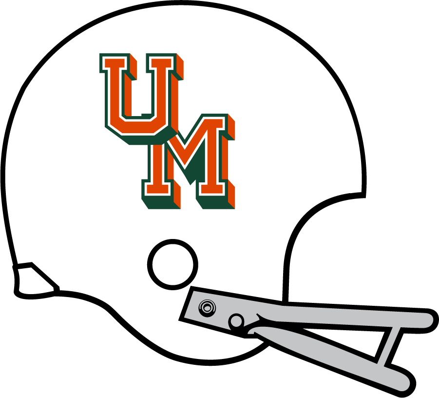
In the early days, Miami's helmet identity moved through the same phase a lot of college programs did: initials. The "UM" monogram seemed logical—it's the abbreviation, it fits cleanly, it's what other universities were doing.

The problem becomes obvious once you say it out loud: "UM" isn't unique. The University of Michigan, the University of Minnesota, the University of Montana—plenty of schools share those initials. On a football field, at broadcast distance, or in a crowded merchandise market, generic monograms blur fast. You might recognize the colors, but the letters could belong to anyone.
Miami needed something that could only be Miami.
The Split-U: Solving a Branding Problem with One Shape
In the early 1970s, Miami's Athletic Federation commissioned work on a more distinctive identity. The school had been cycling through helmet and uniform looks, and the core issue kept surfacing: initials don't build a monopoly on meaning. Any school can put letters on a helmet. What Miami needed was a single, ownable shape.
The solution was elegant in its simplicity: a standalone "U," split vertically into Miami Orange and Miami Green. The university's athletics department credits Miami designer Bill Bodenhamer with suggesting the concept—a mark that could stand completely on its own without spelling out "University of Miami" and that could naturally support slogan-like phrasing.
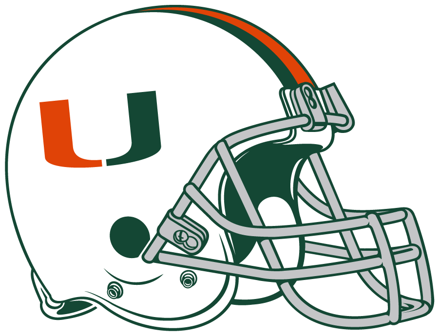
By 1972, the split-U appeared on helmets, and suddenly Miami was instantly recognizable from any distance, at any speed, on any screen.
From a pure design standpoint, the split-U works because it hits every mark a sports identity needs:
- High contrast. Orange and green against each other create immediate visual tension that grabs attention.
- Perfect symmetry. The vertical split is clean and balanced—satisfying to look at and easy to reproduce accurately.
- Readable at speed. Football happens fast. The bold silhouette registers even when players are in motion and cameras are panning.
- Infinitely scalable. The mark is clear on a helmet, clean on a baseball cap, memorable as a tiny social media avatar. That's rare—most sports marks lose clarity at small sizes.
The split-U behaves less like a traditional logo and more like a modern brand asset—a shape flexible enough to work in any context while remaining unmistakable.
Why the Helmet Is the Perfect Canvas
Football helmets are essentially moving billboards. They're the most visible piece of equipment on the field, constantly in frame during broadcasts, and instantly recognizable in photographs. A great helmet mark has to survive distance, motion, stadium lighting, TV compression, and the visual chaos of a pile-up at the line of scrimmage.
The split-U wins in all these conditions because it's a bold silhouette first and a "logo" second. You don't need to read it—you recognize the shape. That distinction matters enormously in sports, where audiences process visual information in fractions of a second.

Once Miami locked in the split-U as the anchor, the program could experiment around it—different helmet shells, various stripe patterns, matte and gloss finishes, special edition designs—while remaining unmistakably Miami. The mark became the constant; everything else became a variable.
How the Logo Created the Nickname
This is the part people often get backwards. The nickname "The U" didn't create the logo—the logo created the nickname.
The split-U became so dominant as an identifier, so singularly associated with Miami athletics, that "University of Miami" could be shortened without any confusion. No other program owned that letter. The mark didn't just represent the team; it became shorthand for the entire institution's athletic swagger, its national championships, its NFL pipeline, its cultural presence in American sports.
That's the ultimate test of a brand symbol: when it becomes bigger than the thing it originally labeled.
"Throwing Up the U": When a Logo Becomes a Gesture
Plenty of teams have famous logos. Fewer teams turn a logo into a physical ritual. Miami did exactly that, and it matters because it transforms brand identity into participation.
According to Sports Illustrated, the tradition of "throwing up the U"—forming the letter with your hands—was created for a rivalry game against Florida State in 1992. It was a deliberate counterpoint to other iconic fan gestures in college football, a way for Miami fans to physically embody their identity.
At that point, the U stopped being just a graphic. It became a symbol fans could perform. You can wear it, chant it, and literally make it with your hands. That's a level of brand engagement that most organizations never achieve.
When Athletics Branding Goes Institutional
Here's where Miami's story gets unusual. Most universities keep their academic and athletic brands somewhat separate—different logos for different contexts. Miami went the opposite direction.
In 2009, the university announced that the split-U would represent the entire university as a bold identity mark—not just athletics. It was an explicit acknowledgment that the athletic iconography had become more recognizable, more emotionally powerful, and more valuable than any academic logo the university had developed.
This is rare. It's an institutional brand "standing on the shoulders" of its athletics department, essentially admitting that the best symbol the university has is the one that started on football helmets.
Evolution Without Revolution
The smartest brand systems don't constantly redraw their core shape. They refine without disrupting recognition. Miami has done this consistently with the split-U.

In 2024, Miami refreshed its athletics marks by updating the shade of "Miami Orange"—a subtle shift to a more modern, vibrant tone. The split-U itself remained completely intact. Same proportions, same split, same fundamental shape. The only thing that changed was the specific color value.
That's the kind of update most fans barely notice—and that's exactly the point. The best brand refreshes are invisible to casual observers while keeping the system current for the people managing it day to day.
What Other Brands Can Learn from Miami
Miami's identity is a masterclass in a simple rule: own a shape, then repeat it relentlessly.
The split-U is not clever in a complicated way. It doesn't have hidden meanings or intricate details that reveal themselves over time. It's clever because it eliminates ambiguity. There's no question what you're looking at. There's no other program it could be confused with.
The strategic steps Miami executed—whether intentionally or through evolution—are worth studying:
- Replace generic with specific. "UM" could be anyone. The split-U could only be Miami.
- Design for the hardest conditions first. If it works on a moving helmet on TV, it works everywhere else.
- Let the mark generate language. "The U" as a nickname emerged from the logo, not the other way around.
- Make the brand participatory. When fans can physically perform your logo, engagement goes to another level.
- Protect the core, evolve the details. Change colors, change applications, but never break recognition.
The split-U isn't just a logo. It's a brand ecosystem—a visual identity that became a nickname, a nickname that became a gesture, and a gesture that became a culture. That's what happens when you get the fundamentals right and then have the discipline to leave them alone.


