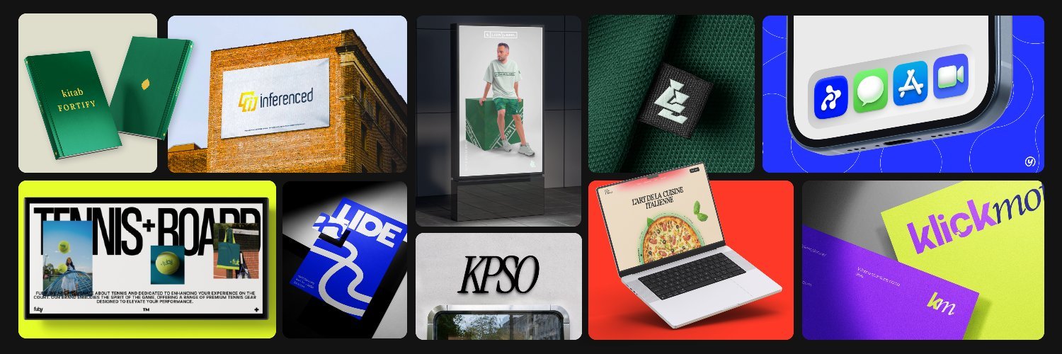
X (formerly Twitter) remains one of the few places where you can watch logo design happen in public: concept sketches, construction grids, brand marks in context, client reveals, and the occasional "here's what I'd fix" redesign thread. If you're building a brand, collecting references, or just trying to stay current with identity design, the smartest move is to follow designers who post consistently and show repeatable thinking—not just one viral logo that caught the algorithm.
This is a curated follow list for mid-January 2026: designers who are active right now, share real identity work (not just AI renders), and tend to be accessible via DM or email in their bio. It's not an awards ranking or a "best of all time" list—it's a practical shortlist for people who need inspiration they can actually use or hire.
Startup-Ready Designers
If your brand lives on landing pages, pitch decks, and product interfaces, you need marks that feel crisp at small sizes and systems that look cohesive from day one. These designers specialize in that modern, ship-ready aesthetic.
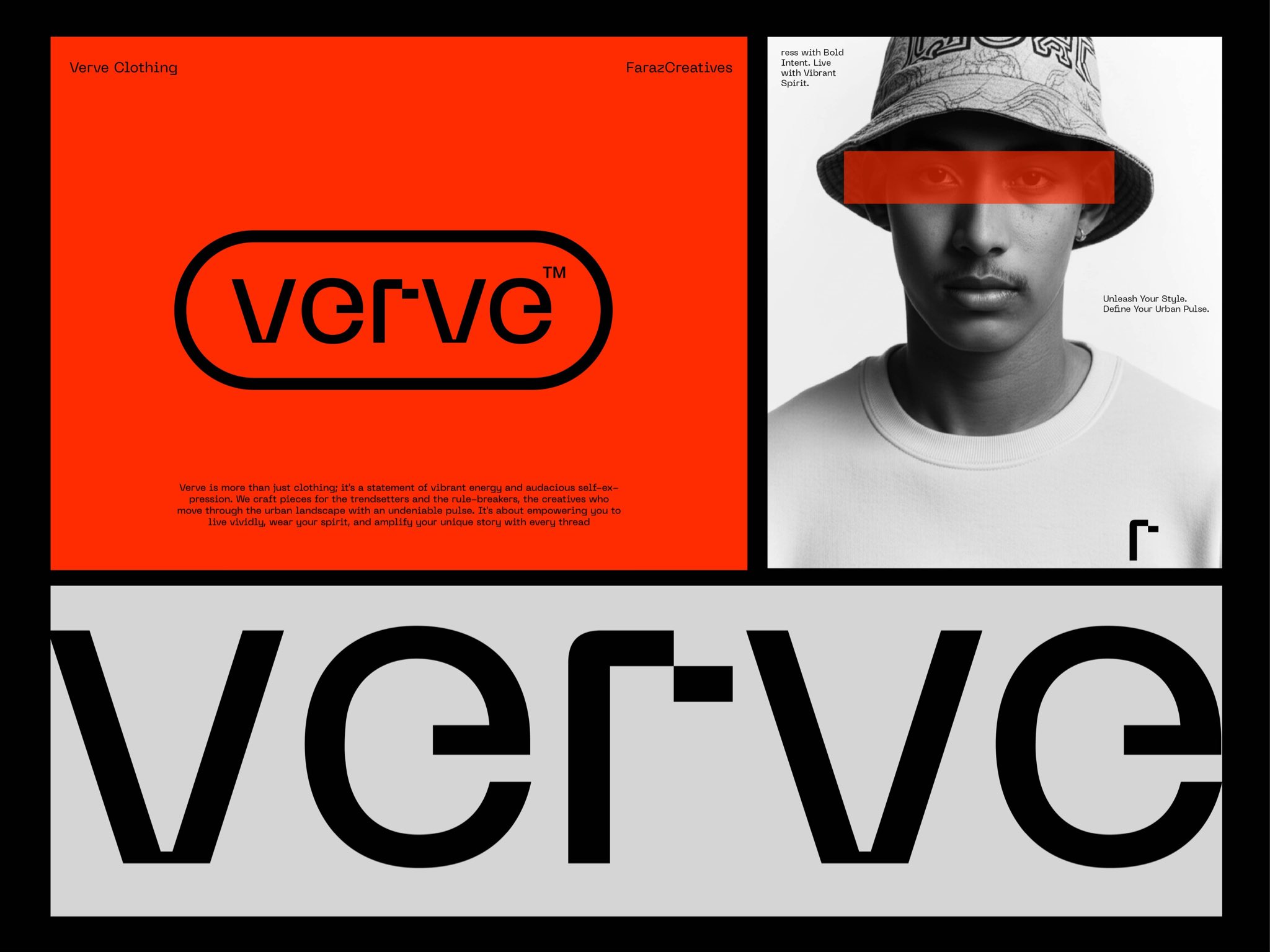
Faraz (@farazcreatives) consistently posts polished, premium-feeling identity work that reads "ready to ship." If you need a reference point for modern startup branding—clean wordmarks, tight icon systems, sophisticated color palettes—his feed delivers. The work feels expensive without being overwrought.
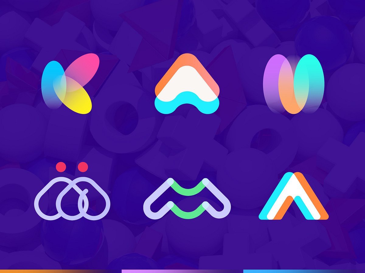
designbydi (@designbydi) leans web-first and B2B/SaaS-friendly. If you care more about clarity, hierarchy, and conversion than decorative flourish, this is your reference. The work prioritizes function—logos that sit cleanly in navbars and favicons, brand systems that make marketing pages feel trustworthy.
Dev Nath (@devxnuj) often shows identity as a complete system, not just a mark in isolation. That's valuable for founders who need to see how logo, layout, and brand components work together. If you're thinking about your brand as a kit of parts rather than a single image, follow this feed.
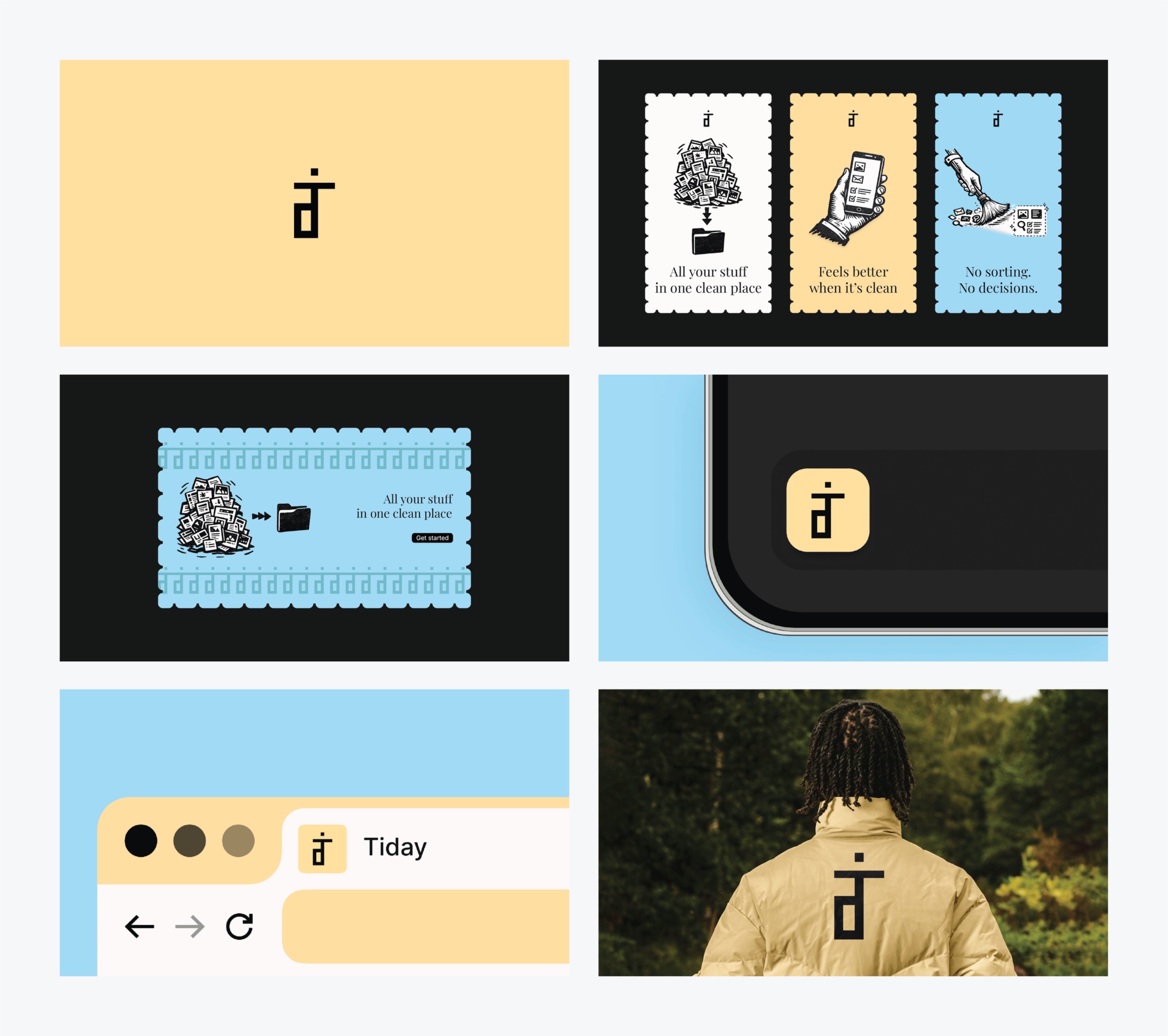
Yahyavision (@yahyavision) brings high posting energy and consistently modern branding direction. The work often frames around helping startups stand out with clean, current visuals that feel native to today's product landscape. Good for staying calibrated on "what looks fresh right now."
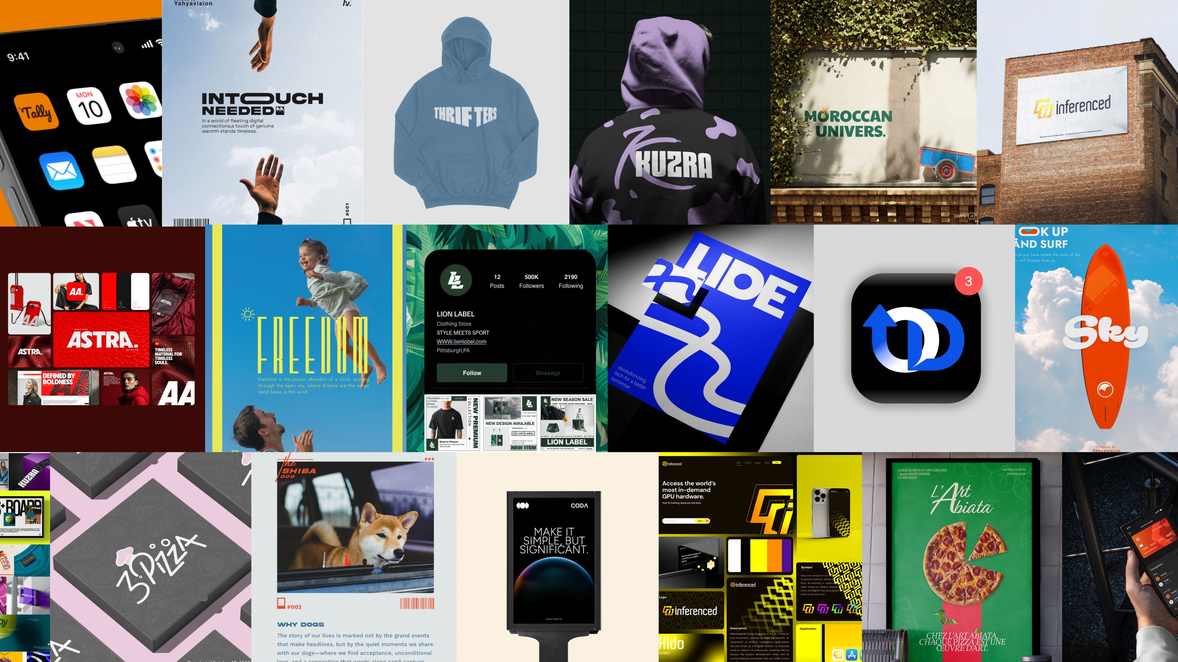
Mihai Dolganiuc (@MihaiDolganiuc) tends to present concepts the way you'd pitch them to a client—context, rationale, applications. That's helpful if you want to see how designers sell the idea, not just the final vector. Understanding the "why" behind a mark is often more valuable than the mark itself.
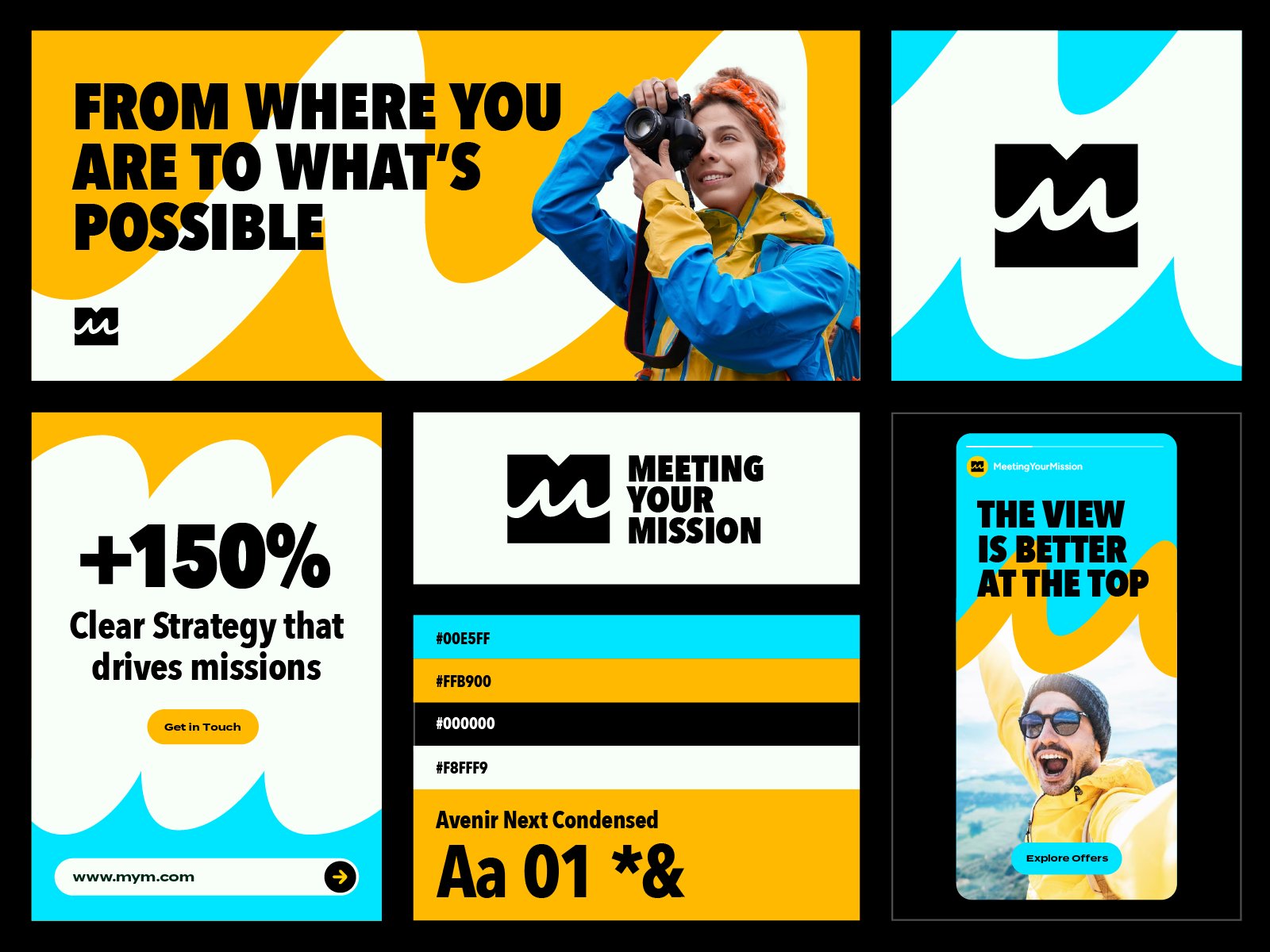
Concept-First Designers
These are the designers to follow if you care about symbolism, meaning, and longevity—marks that still make sense five years from now because they're built on solid conceptual foundations, not surface trends.
Jeroen van Eerden (@Jeroenvaneerden) is a strong reference for restraint and timelessness. The logos feel intentional rather than trendy—each element justified, nothing decorative for its own sake. If you're allergic to "busy" and want to understand what makes simple marks work, study this feed.
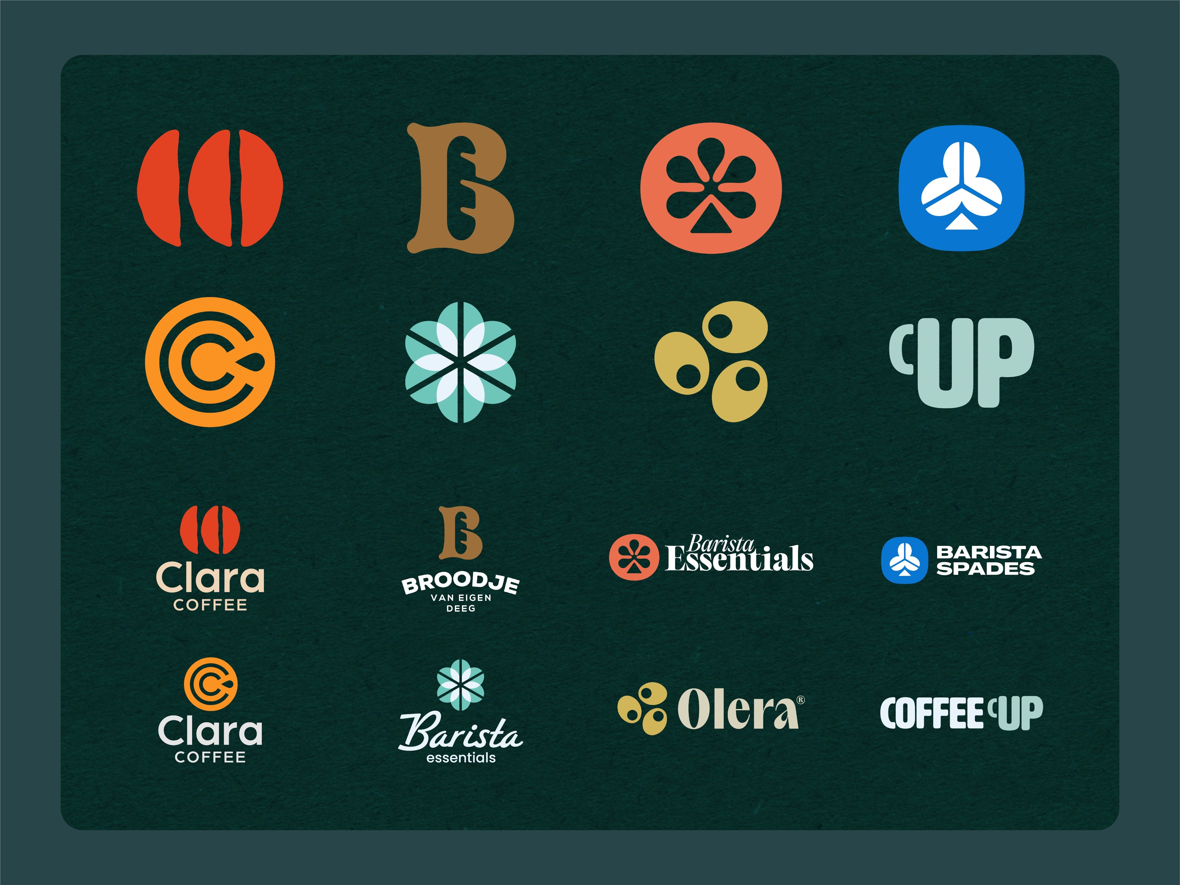
Irfan Khatri (@dzineloop) leans refined and geometric, consistently landing on marks that feel precise, modern, and app-ready. There's a mathematical quality to the work—grids you can sense even when they're not shown. Good for anyone who appreciates logos as carefully engineered objects.
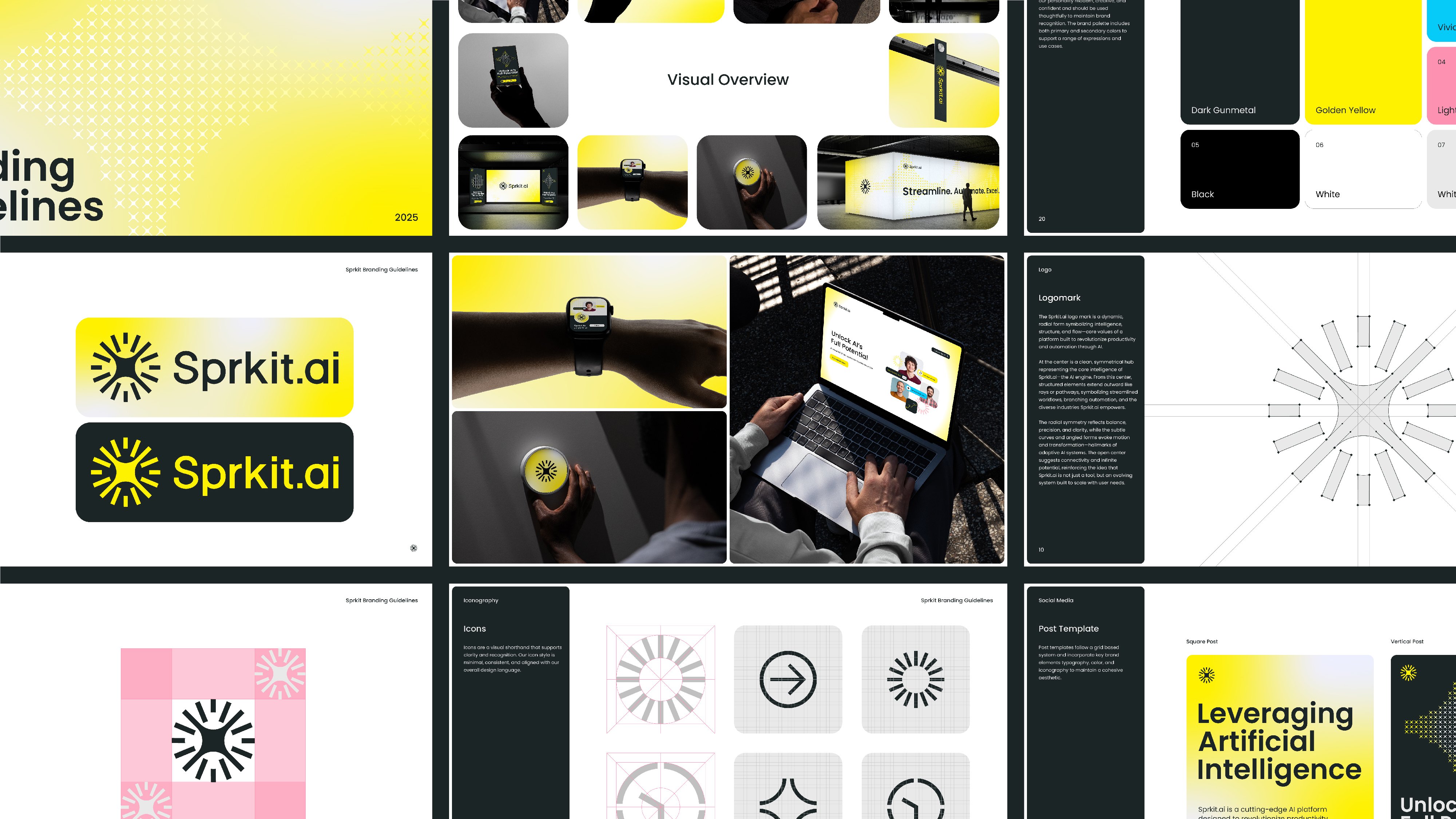
Andrii Kovalchuk (@Kovalchuk_logos) shares plenty of redesign concepts and clean symbols. The work tends toward simple, scalable, and icon-strong—logos that would work as app icons as easily as they'd work on a billboard. If you like seeing familiar brands reimagined through a cleaner lens, this feed delivers regularly.
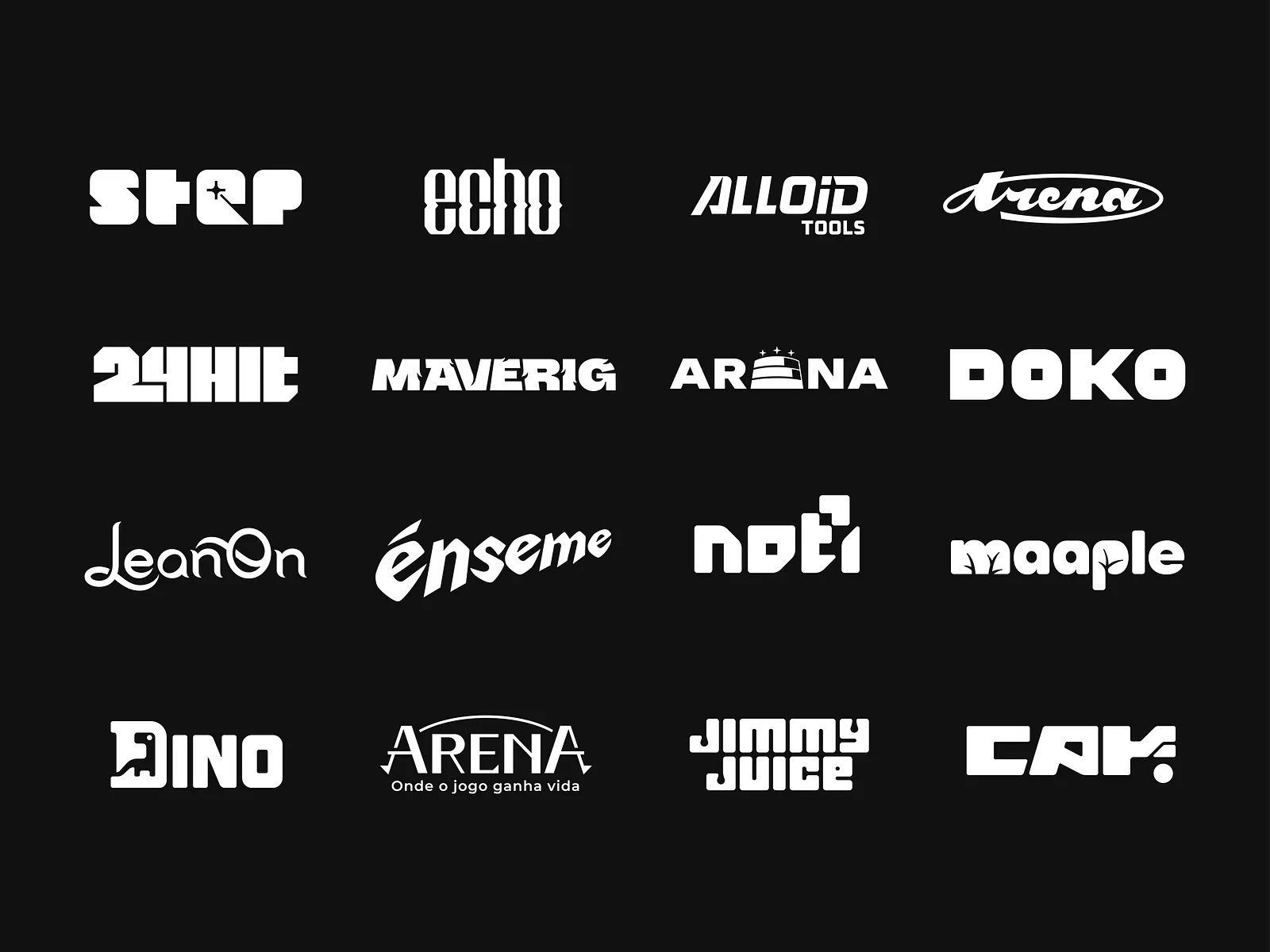
Ramin Nasibov (@RaminNasibov) often delivers bold, memorable silhouettes—marks with presence and punch. The work isn't shy. If you want logos that command attention rather than blend politely into a header, this is useful reference for understanding how to design with confidence.
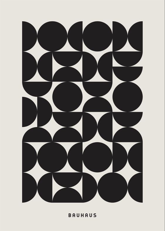
Tina Brown (@realtinabrown_), known as "Logo Queen," leans strategic and meaning-led. The emphasis is often on minimal logos with narrative depth—marks that look simple but carry conceptual weight when you understand the thinking. Good for appreciating the difference between "minimalist" and "thoughtfully reduced."
High-Output Builders
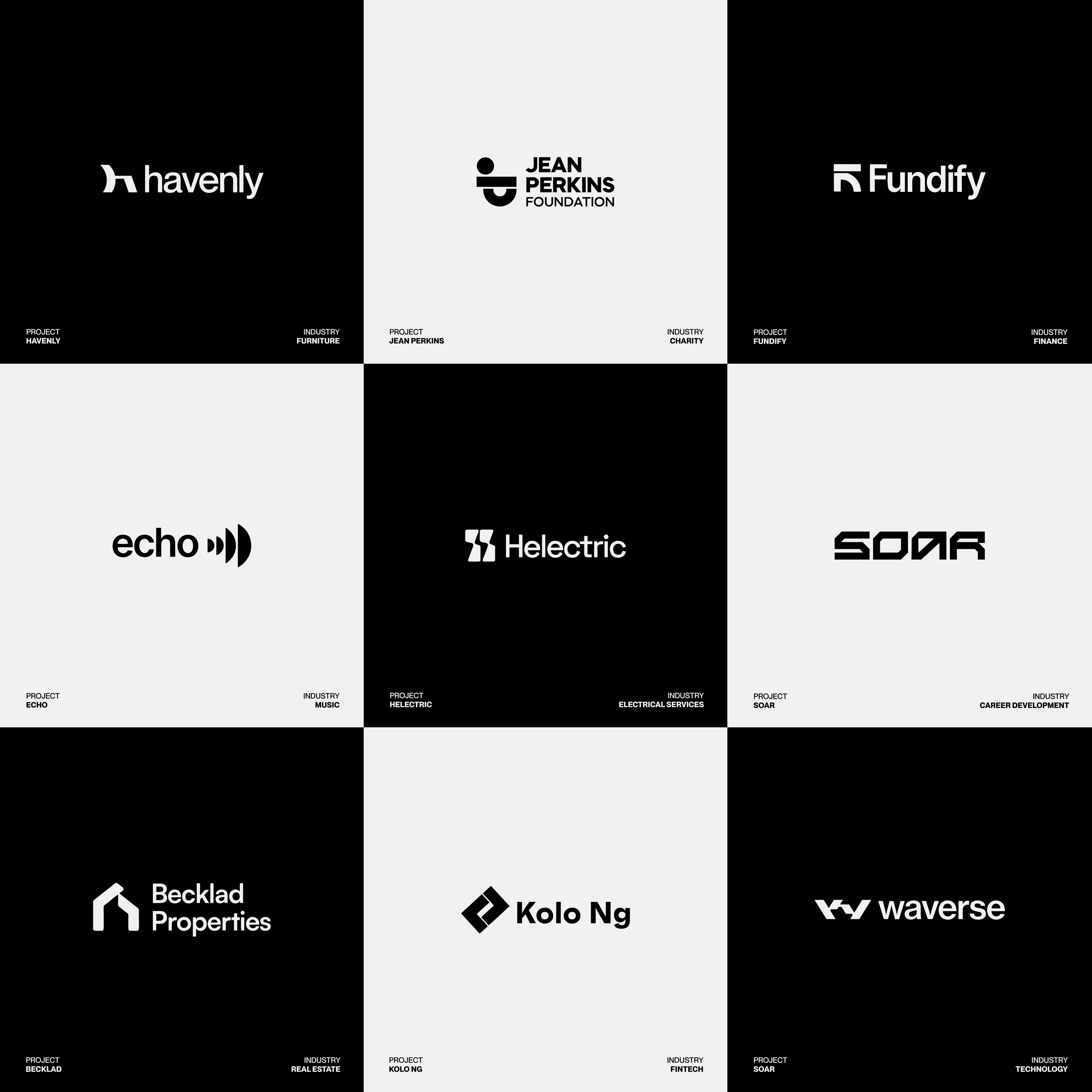
If you want inspiration and consistency, follow the designers who ship constantly. The upside is volume—tons of references, daily fresh marks, endless fodder for your swipe file. The downside is you'll need to judge which posts are exercises versus client-ready work. That's fine. Volume builds taste.
Noah (@amixaura) is known for challenge-style output—daily logos, themed series, consistent reps. Great for watching someone practice core logo fundamentals in public. You'll see hits and misses, which is actually more educational than a curated "greatest hits" portfolio.

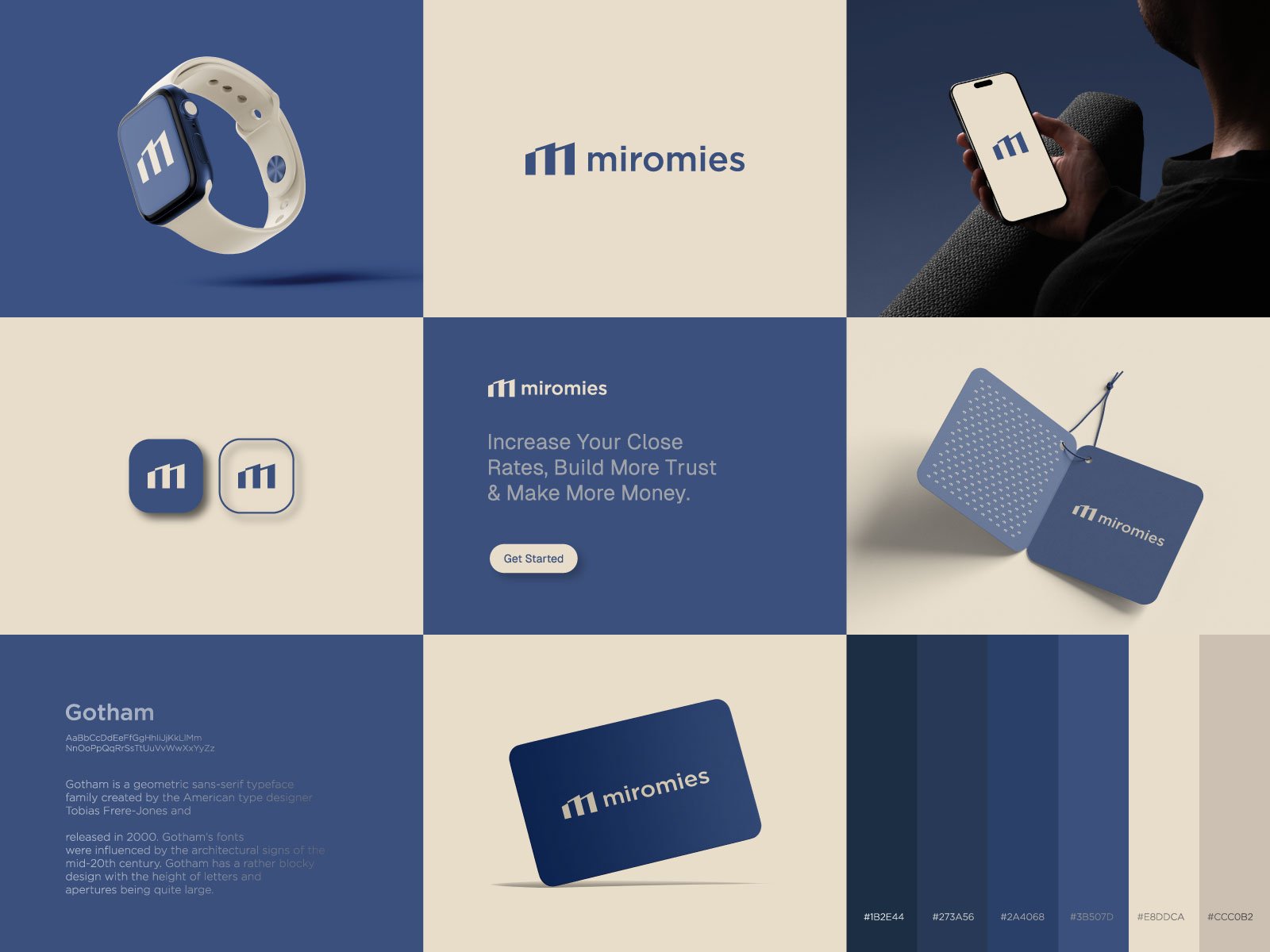
Joyanta Roy (@nicalo06) is great when you want more than a logo: palettes, lockups, and system-level snapshots that show how a brand hangs together across applications. Identity design isn't just a mark—it's the mark plus everything around it, and this feed shows that thinking.
How to Use This List
The fastest way to pick the wrong designer is to fall in love with a single image. One beautiful logo post proves almost nothing. Maybe it was the designer's best work ever. Maybe the client never approved it. Maybe it only works at that exact size on that exact background.
Instead, look for evidence that a designer can build marks that survive real-world use:
- Check real applications. Do they show the logo on a website header? Packaging? App icons? Signage? Business cards in bad lighting? The more contexts you see, the more confidence you can have.
- Check consistency. Look at the last 20 posts, not just the pinned one. Is the quality repeatable, or is there one standout buried in filler?
- Check category fit. A designer who excels at luxury fashion marks might struggle with playful children's brands. Does their "best work" match your industry, audience, and tone?
- Check responsiveness. Do they reply to comments? Is there a clear way to contact them? The best portfolio in the world doesn't help if you can't actually hire the person.
Building a follow list is step one. The real value comes from watching these feeds over weeks and months—noticing what makes certain marks stick in your memory, understanding why some concepts feel fresh while others feel derivative, and slowly calibrating your own eye for what works. That education is free. Use it.
