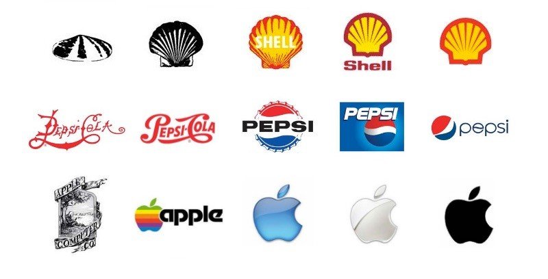
A logo redesign is one of the highest-risk "small" decisions a brand can make. Customers notice. Employees argue. The internet turns it into a referendum. And yet, the best redesigns often share the same quiet strategy: change less than people think, but improve what matters most.
Below are ten widely-circulated redesign examples, paired with the real reason they work: not aesthetics alone, but clarity, scalability, and brand equity management.
The Common Thread
When redesigns succeed, it's rarely because the new mark is "prettier." It's because the new mark is more useful. Better at small sizes. More consistent across channels. More ownable. More aligned with what the brand has become.
If you want a simple filter: a good redesign improves the logo as a tool, not just as an image.
1. Google (2015): Modernize Without Losing Recognition
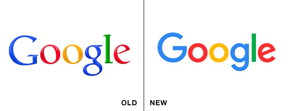
With a pure wordmark, the safest redesign lever is typography. Google's update kept the color rhythm and friendly proportions, but shifted to a more geometric, screen-native look. The result feels like Google—just better adapted to modern interfaces. This is the "don't change the melody, improve the mix" approach.
2. Coca-Cola (2007): Refine an Icon, Don't Rebrand It
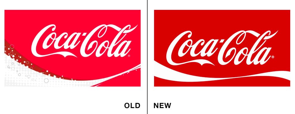
Some brands don't need a new identity; they need less noise. Coca-Cola's best modern updates kept the script equity intact, while stripping back extra effects so the mark stays iconic on cans, bottles, billboards, and endless packaging variations. For legacy consumer brands, recognition is the asset—the redesign job is to preserve it while cleaning up the system around it.
3. Starbucks (2011): Drop the Words When the Symbol Is Strong Enough
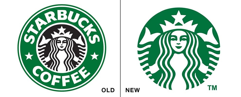
This is a classic confidence play: if the symbol is globally recognizable, the wordmark becomes optional. Starbucks' simplified siren makes the logo more versatile, more "stampable," and easier to deploy across products and packaging. Removing elements can feel like adding power.
4. Instagram (2016): Replace Detail with a Scalable Icon
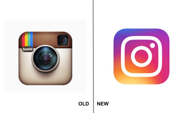
The old Instagram icon had charm—but also lots of detail that collapses at small sizes. The newer mark is essentially a simplified camera glyph with a distinctive gradient system. Whether you love gradients or not, the strategy is clear: optimize for modern UI, not nostalgia.
5. Netflix (2014): Ditch Dated Cues, Keep the Equity
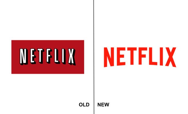
Netflix didn't need a new idea—it needed a new era. The 2014 refresh ditched the heavy background box and drop shadow, keeping the recognizable wordmark energy while making it work across screens, posters, and product surfaces. It's a lesson in subtraction: delete the parts that age the fastest.
6. Airbnb (2014): Build a Symbol Meant to Travel
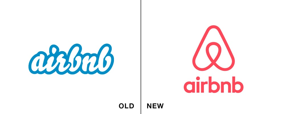
Airbnb's redesign is a textbook case of shifting from "name on a screen" to "symbol in culture." The Bélo mark is simple enough to sketch, flexible enough for brand patterns, and recognizable without the wordmark. That's what it means to build a brand asset—not just a logo.
7. Mozilla (2017): Typography That Encodes the Internet
Mozilla's redesign stands out because it's not just "clean"; it's conceptually on-theme. The "://" nods to URLs and internet structure, turning the logo into a small piece of insider language. The lesson: typography can carry meaning if you bake the story into the letters.
8. Facebook (2019): Minimal Change, Maximum Usability
Not every redesign needs a new concept. Sometimes the goal is to remove dated styling and standardize the icon so it behaves across products. Facebook's update is a reminder that subtle improvements can be the most brand-safe improvements.
9. Qantas (2016): Keep the Mascot, Sharpen the Motion

Airline brands live on aircraft tails, signage, and uniforms—places where icons must read instantly. Qantas shows the "evolve, don't replace" approach: keep the kangaroo, sharpen the forms, refine the type, and make the whole system feel more contemporary. Familiar, but upgraded.
10. Olive Garden (2014): Signal a New Experience
Hospitality logos are basically promises. Olive Garden's shift toward cleaner typography and a lighter, more modern composition is less about a graphic preference and more about repositioning the dining feel. The logo becomes a signal: fresher, simpler, more contemporary.
The Repeatable Checklist
If you're redesigning a logo, you don't need to imitate these brands—you need to imitate the logic. The best redesigns typically do three things: protect equity, improve usability, and clarify what the brand stands for now.
Here's the simplest test to run: put the old logo and the new logo into real contexts—app icon, website header, packaging, social avatar, signage. If the new one is consistently clearer and still instantly recognizable, you're on the right path.
