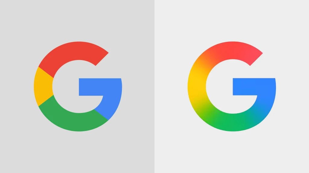
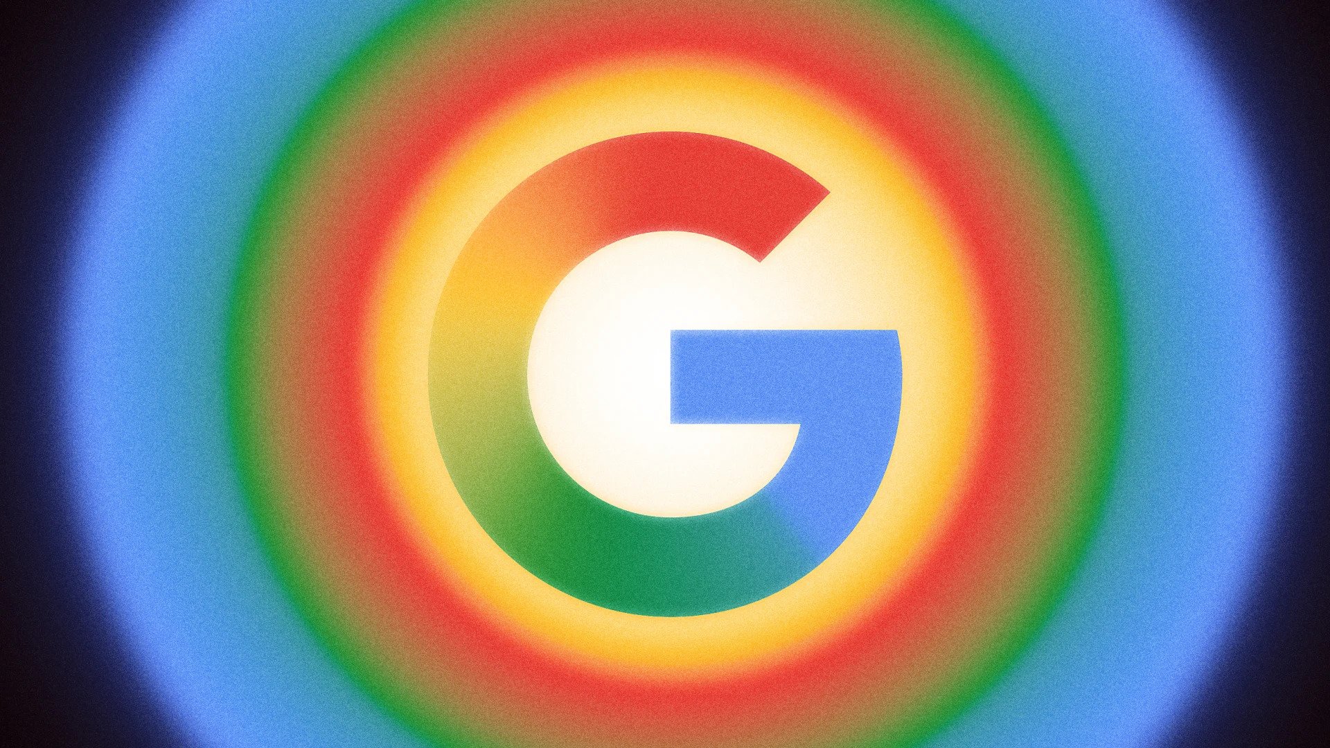
At first glance, it barely registers. The letterform is identical. The colors haven't changed. But Google's iconic "G" has quietly shifted from crisp color blocks to a smooth gradient blend—and that tiny tweak reveals a lot about where the world's most recognized tech brand is heading next.
This isn't a dramatic rebrand or a controversial redesign. It's something more subtle and, arguably, more interesting: a design-system evolution that can ripple through billions of screens without most people consciously noticing the change.
The Shift: Hard Edges to Soft Blends
The "G" hasn't been redrawn. The proportions remain untouched. What Google changed is the transition between colors—replacing the hard, definitive edges between red, yellow, green, and blue with a continuous gradient that flows seamlessly around the letterform.

The result? The same icon, but softer, more fluid, and subtly more alive. It's the visual equivalent of upgrading from a mechanical click to a smooth haptic tap—functionally identical, but experientially different.
This is not a "new logo" moment. It's a design-system nudge—one that can roll quietly through app icons, favicons, and product marks without disrupting the instant recognition that Google has spent decades building.
Where It's Appearing First
Identity updates like this typically debut where icons live at their smallest—app icons, favicons, and compact UI surfaces. That's where tiny refinements have outsized visual impact, and where harsh edges can feel jagged or overly mechanical on high-resolution displays.
Early sightings include:
- The Google app icon on mobile devices—the most common touchpoint for the "G"
- Pixel and Android surfaces where Google controls the presentation with precision
- Gradual expansion into other Google-owned apps and services as the design system propagates
If you're building brand systems, take notes: this is the modern rollout playbook. Ship a small component first. Validate perception. Let familiarity settle. Then propagate across the ecosystem without fanfare.
Why Gradients, Why Now?
Gradients have become the safe "upgrade" of the post-flat design era. They're still clean and modern, but less sterile than pure flat color. They add depth and warmth without reintroducing the skeuomorphism or heavy textures of the pre-2013 design world.
But there's more strategy at play here. Gradients are doing double duty in tech branding right now:
- They signal "AI-native" without saying a word. The soft, computational aesthetic has become visual shorthand for machine learning and generative AI.
- They unify design language across products that need to feel related—even when their user experiences differ dramatically.
- They scale beautifully at tiny sizes where harsh color boundaries can look jagged or dated on modern displays.
This looks like Google optimizing for a more cohesive "AI era" visual vocabulary—soft, blended, and slightly more human—while preserving every ounce of existing brand equity they've accumulated.
Ripple Effects Across the Design System
The "G" icon is the face of Google on your home screen. When that face evolves, it becomes the new reference point for everything else: product icons, motion language, loading states, marketing graphics, and environmental design.
If the gradient style spreads—and design system logic suggests it will—expect a slow drift toward:
- Softer transitions in product marks and UI accent colors
- More visual continuity between Google's core apps and its AI-focused branding (think Gemini, Bard successors)
- A refresh of secondary icons where the current flat-block aesthetic may start to feel "previous generation"
The brilliant part? None of this requires users to "learn" anything new. The recognition is intact. Only the feeling has shifted.
Lessons for Brand Builders
Whether you're managing a global identity system or a startup logo, there's signal in how Google approaches evolution:
- Change texture before shape. You can modernize significantly while keeping recognition completely intact.
- Roll out through small surfaces first. Icons and favicons are low-drama places to test identity shifts before committing fully.
- Let the system do the work. One tiny update, properly documented, can cascade across an ecosystem over months without requiring a "launch moment."
- Design for the two-second glance. Most people don't study logos—they register vibes. The gradient "G" feels more current even if viewers can't articulate why.
In an era where brands are expected to feel simultaneously timeless and contemporary, Google's gradient shift is a masterclass in having it both ways.


