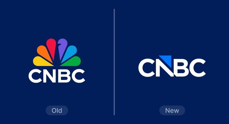
At first glance, CNBC's new logo looks like a modern tidy-up. But the real story isn't kerning or triangles. It's that CNBC removed the NBC peacock after nearly 30 years and replaced it with a new, ownable signature: an arrow/tick that lives inside the letter N. Visually restrained, strategically massive.
Before vs. After
The Real Change: CNBC Stops "Renting" Recognition
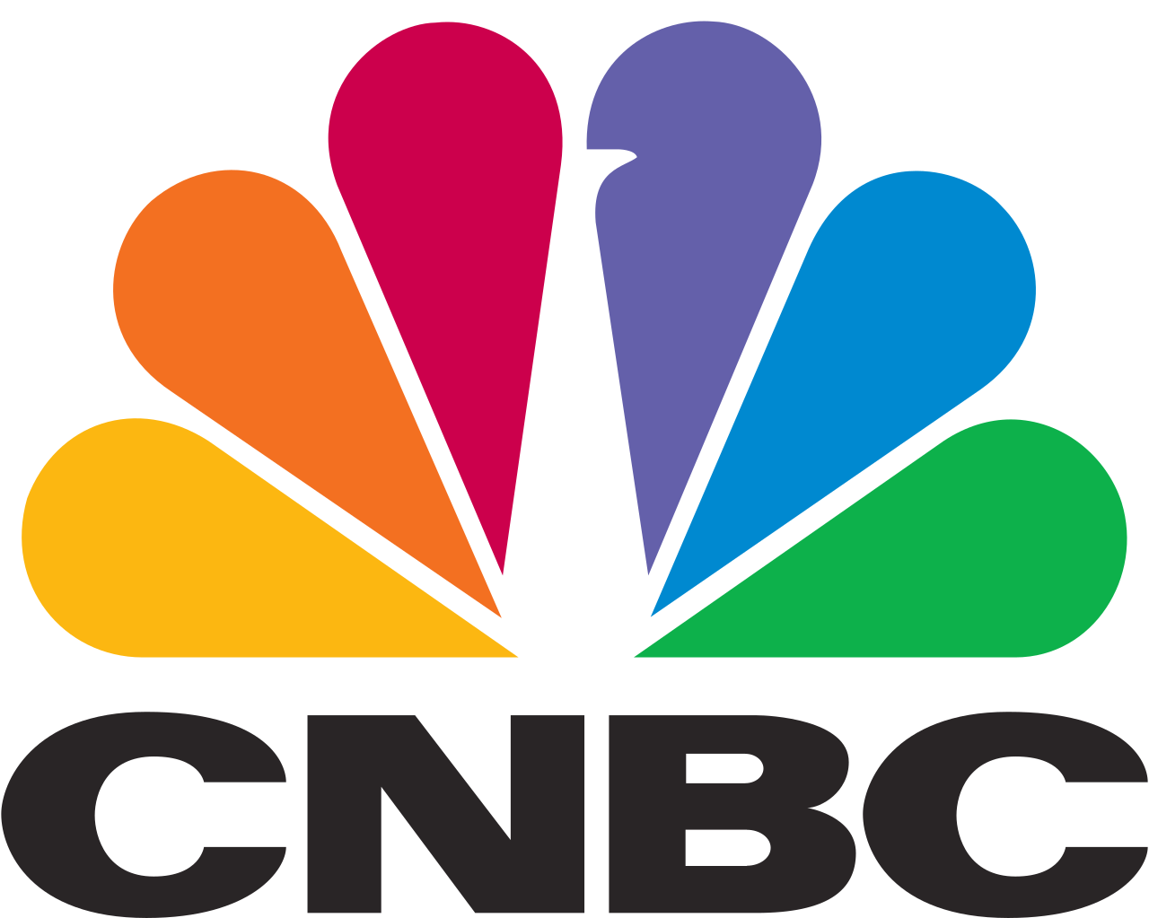
The peacock did a lot of work. It signaled broadcast heritage, it boosted recognition, and it made CNBC feel like part of a larger media family. Removing it forces a harder question: what's CNBC's symbol when CNBC has to stand on its own?
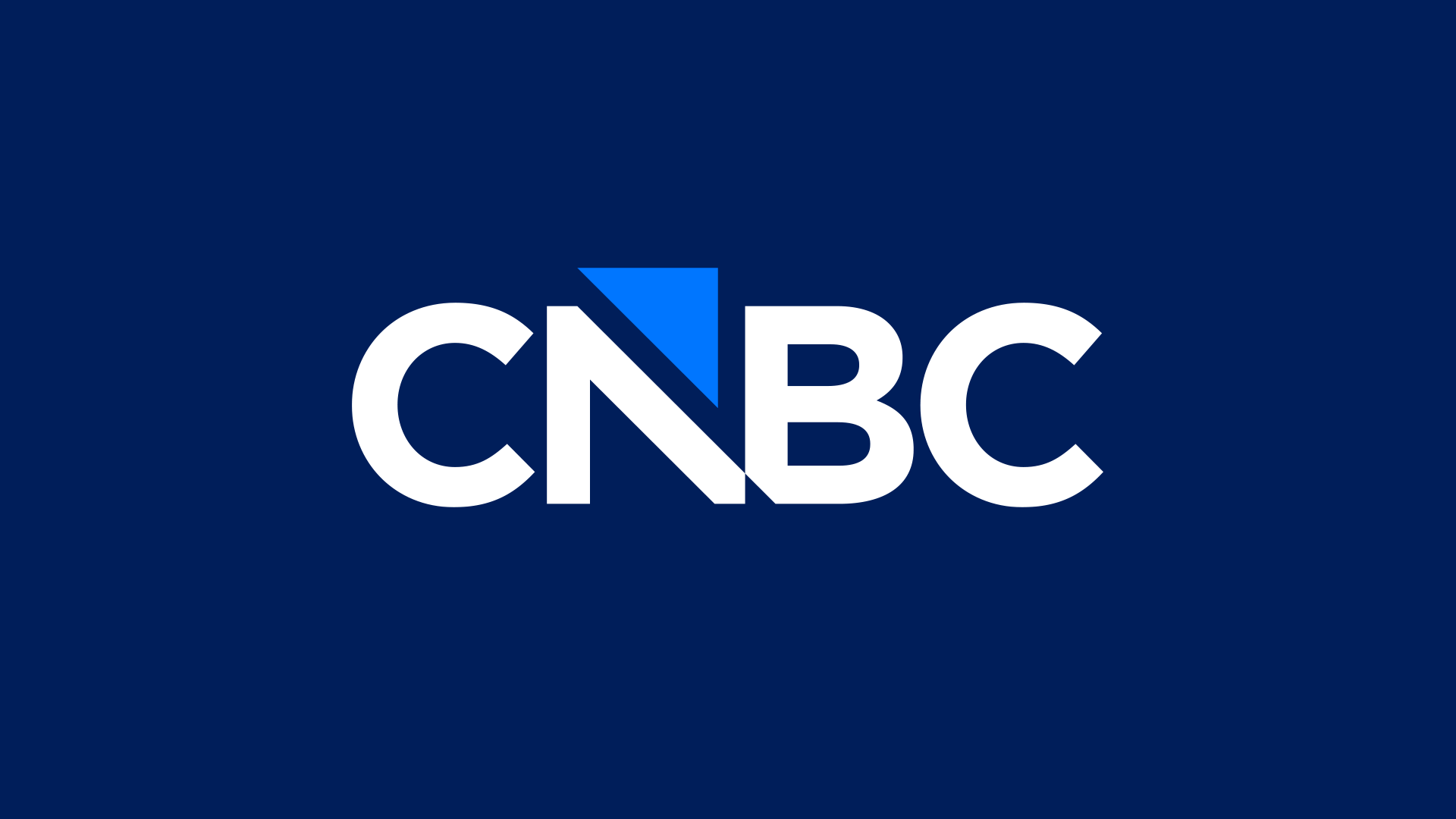
The answer isn't a new mascot or a complicated emblem. It's a piece of visual language CNBC already uses constantly: the arrow/tick of market movement. That's why the new signature doesn't float as a separate icon — it's integrated into the wordmark. It's branding that behaves like a UI element.
The "N" Hack: Turning Negative Space into Meaning
If you only look at the triangle, you miss the trick: the mark is designed to feel like it belongs in charts, tickers, and on-air graphics. The cut inside the N reads as direction — a tiny piece of up/down language you already associate with financial news.
This is why the redesign triggers strong reactions. People aren't reacting to a shape; they're reacting to a swap in identity: from "CNBC with NBC's icon" to "CNBC as its own thing."
Typography and Spacing: Built for the Corner of the Screen
CNBC's logo lives in one of the harshest environments: small, persistent, compressed, and constantly competing with information. The updated wordmark feels denser and more compact, which helps it hold its shape as a corner bug, in app headers, and in avatars. It's less a poster logo and more a broadcast component.
The important part: even if you hate the arrow, the core "CNBC" block is still strong and readable. The redesign keeps recognition anchored in the name, not in a separate symbol.
Why It Feels "Bigger" Than It Looks
Most rebrands change the mark. This one changes the relationship behind the mark. Losing the peacock is like removing a co-signer from a loan: suddenly the brand has to prove it can carry the weight alone.
That's why calling this "small" is misleading. The new logo may be cleaner and simpler, but the identity shift is one of the most significant changes CNBC has made in decades.
What to Watch in the Rollout
The verdict won't come from a single PNG. It'll come from repetition: on-air opens, tickers, mobile icons, YouTube thumbnails, social avatars. If that arrow/tick becomes a consistent device across the system, it'll start to feel inevitable.
The practical tests are simple: does it read at tiny sizes? does the cut look intentional under compression? does it animate cleanly? If yes, the redesign will age well — even if the first reaction is "wait… what?"
Takeaway: This isn't a "logo tweak." It's a brand choosing to stop borrowing a famous symbol—and building a new shorthand from the language of its category.
