Fonts do two jobs at once: they communicate personality, and they carry information. When a brand's typography feels "off," it's usually because the font is doing only one of those jobs well—looking distinctive but being hard to read, or being perfectly legible but feeling generic and forgettable.
This guide is a practical framework for choosing typefaces that look right, read well, and scale across your entire brand system—website, packaging, social media, print collateral, and whatever surfaces you haven't thought of yet. No moodboard mysticism. Just decisions that work.
Start with the Job, Not the Font
Most font picking goes wrong at the very first step. Designers open a type library and scroll until something "looks cool." That approach can work for a poster or a one-off project, but branding needs repeatability. You're not choosing a font for one moment—you're choosing a font that will represent your brand across thousands of applications over years.
Before you even browse fonts, define the real-world job typography must do. Think in constraints:
- Where will the type live most? Website body copy? App interfaces? Packaging? Menus? Signage? Long-form articles? Each context has different requirements.
- What are your non-negotiables? Readability at small sizes? Print quality on textured paper? Multilingual support for expansion? Specific numeral styles for pricing? Web font licensing that won't break the budget?
- What will kill a font immediately? No Cyrillic and you're launching in Eastern Europe? That eliminates options. Only available in two weights? That might not be enough.
The answers eliminate options fast—and that's exactly the point. Constraints are gifts. They turn an overwhelming type library into a manageable shortlist.
Define Your Voice in Plain Language
Brand voice shouldn't live in a vague moodboard full of abstract imagery. Use words you can actually defend—and pair each descriptor with its opposite so you know where the boundaries are.
For example:
- Confident (not aggressive)
- Premium (not precious)
- Friendly (not childish)
- Modern (not sterile)
- Approachable (not casual)
These pairings matter because they prevent drift. "Friendly" alone can slide into Comic Sans territory. "Friendly, not childish" keeps you in the right zone. Typography is tone-of-voice you can see—and these guardrails ensure the visual tone matches the verbal one.
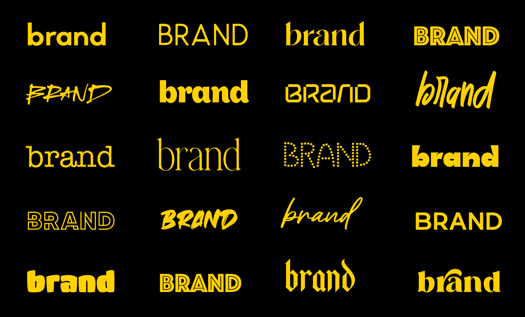
Choose Your Primary Typeface by Where It Will Be Read
Here's a truth that sounds obvious but gets ignored constantly: the most important font in most brands is the one used for body copy. Not the headline font. Not the logo typeface. The workhorse text font that carries 80% of your actual communication.
If your brand publishes text—articles, product descriptions, emails, documentation, menus—pick the body font first, then build everything else around it. The body font is the foundation; the headline font is the accent.
When evaluating body fonts, test at realistic sizes and line lengths. A font that looks stunning at 64px in a type specimen can be exhausting to read at 16px in a 600-word article. Conversely, a great text font can look bland and lifeless in hero headers unless it's paired with something that brings character.
Don't trust previews. Set real paragraphs. Read them. Notice where your eyes get tired.
Headlines Are Where You Earn Distinctiveness
Many modern brands end up looking identical because they choose a neutral sans-serif and use it for everything. Inter. Helvetica. SF Pro. These are excellent typefaces, but when everyone uses them the same way, brands blur together.
Your headline font is the cheapest place to buy personality. Headlines are big, visible, and relatively sparse—you can afford more distinctiveness there without sacrificing readability. Body copy has to work hard across thousands of words; headlines only need to work for a few.
You don't need to go extreme. Pick one clear signature trait that makes your typography feel specific without feeling gimmicky:
- Tighter proportions that feel more editorial
- More stroke contrast that reads as premium
- Sharper geometry that signals tech-forward
- A particular curve rhythm that creates warmth
- Unusual x-height that catches the eye
One distinctive trait is enough. Two can work. Three usually becomes a costume.
Pair Fonts Like a System, Not a Couple
Font pairing advice usually focuses on aesthetics: "This serif looks beautiful with that sans-serif." That's nice for a wedding invitation, but branding requires a different question: will this pair stay consistent and clear across dozens of different use cases without turning into visual chaos?
A strong pairing has a clear division of labor:
- One font carries information: body copy, UI elements, captions, metadata, fine print.
- One font carries character: headlines, pull quotes, key labels, hero moments.
If both fonts are loud and distinctive, they fight for attention. If both fonts are quiet and neutral, you look generic. The best pairings have asymmetric energy—one leads, one supports.
And don't ignore numerals. If you show prices, dates, statistics, or scores, your number design matters. Some fonts have beautifully designed letters and awkward, cramped digits—and that mismatch shows up fast in real applications. Check the numbers before you commit.
Build a Small Type Ladder (and Stop There)
Most brands don't need a complex typographic scale with fourteen carefully calculated steps. They need consistency. A simple system that people can follow without asking permission beats a sophisticated one that nobody uses correctly.
Define a small ladder:
- Hero headline: The big moment. Maximum impact.
- Section headline: Organizes content. Clear but not dominant.
- Body text: The workhorse. Optimized for reading.
- Caption/metadata: Supporting information. Smaller, quieter.
For each level, specify the font, weight, size, line height, and letter spacing. Document it. Make it easy to copy. When typography is consistent, it starts doing the layout work for you—hierarchy becomes automatic, and every new piece of content feels like it belongs.
Test Fonts in Ugly Conditions
Fonts get approved in perfect mockups: ideal lighting, carefully chosen background colors, plenty of whitespace, placeholder text that fits perfectly. Then reality happens. Busy photography. Mobile screens. Black-and-white printing. Legal disclaimers that have to fit in a specific space.
If your typography survives ugly conditions, it will look great in the nice ones. The reverse isn't true.
Stress-test your fonts before you commit:
- Print in black-and-white on cheap paper
- View on a 320px mobile screen
- Put type over busy, high-contrast photography
- Try everything in all caps
- Push body text down to 12px
- Use real content, not lorem ipsum—real product names, real menu items, real headlines with awkward lengths
The fonts that pass these tests are the fonts that won't embarrass you in production.
Mistakes That Make Brands Look Amateur
The fastest way to look unprofessional isn't choosing the wrong font—it's inconsistent application disguised as creativity. Too many weights used arbitrarily. Random tracking changes that "felt right" in the moment. Headline styles that drift from piece to piece. These create a brand that feels improvised and untrustworthy.
Common failures to avoid:
- Choosing a trendy font with limited support. Check language coverage, weight range, and licensing before you fall in love. Brands break when they expand into new markets or need a weight that doesn't exist.
- Confusing premium with thin. Ultra-light weights can feel elegant in a hero header at 120px and become illegible at 14px. Legibility is a luxury feature. Don't sacrifice it for aesthetics.
- Ignoring the system. A beautiful font used inconsistently looks worse than an average font used consistently. The system is the brand, not the individual choice.
When You're Stuck Between Two Fonts
If you're torn between options after doing all the work above, stop looking at alphabet previews and type specimens. They're designed to make fonts look good. Run one real test instead.
Set the same paragraph, the same product card, and the same headline in both fonts. Use your actual content. Put them side by side.
Then ask one question: Which one makes your content feel more believable?
Not prettier. Not cooler. More believable. The right font makes everything you say land with more authority, more trust, more "of course this is how it should look." That gut-level credibility is what you're buying when you choose a typeface—and it's more important than any aesthetic preference.
Typography isn't decoration. It's the voice your brand uses when pictures aren't enough.
