2025 has already delivered a wave of notable logo redesigns—some subtle refinements, others complete overhauls. From airlines to tech startups, cosmetics to government agencies, brands across industries are rethinking their visual identities. Here's a look at 30 of the most significant logo redesigns of 2025 and what makes each one work (or not).
1. Royal Ballet and Opera
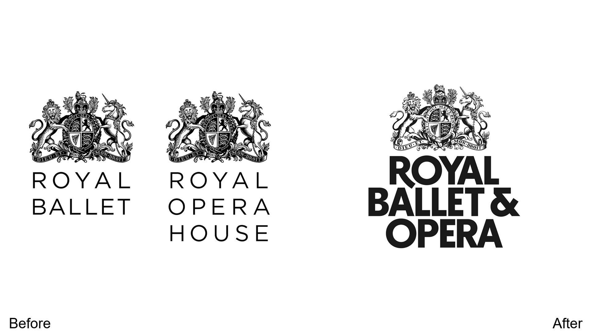
The dark coat of arms gets brightened with increased contrast, making the animal motifs more visible. The monochrome name is now bolder—a smart move for a heritage institution modernizing without losing gravitas.
2. Anna Von Lipa
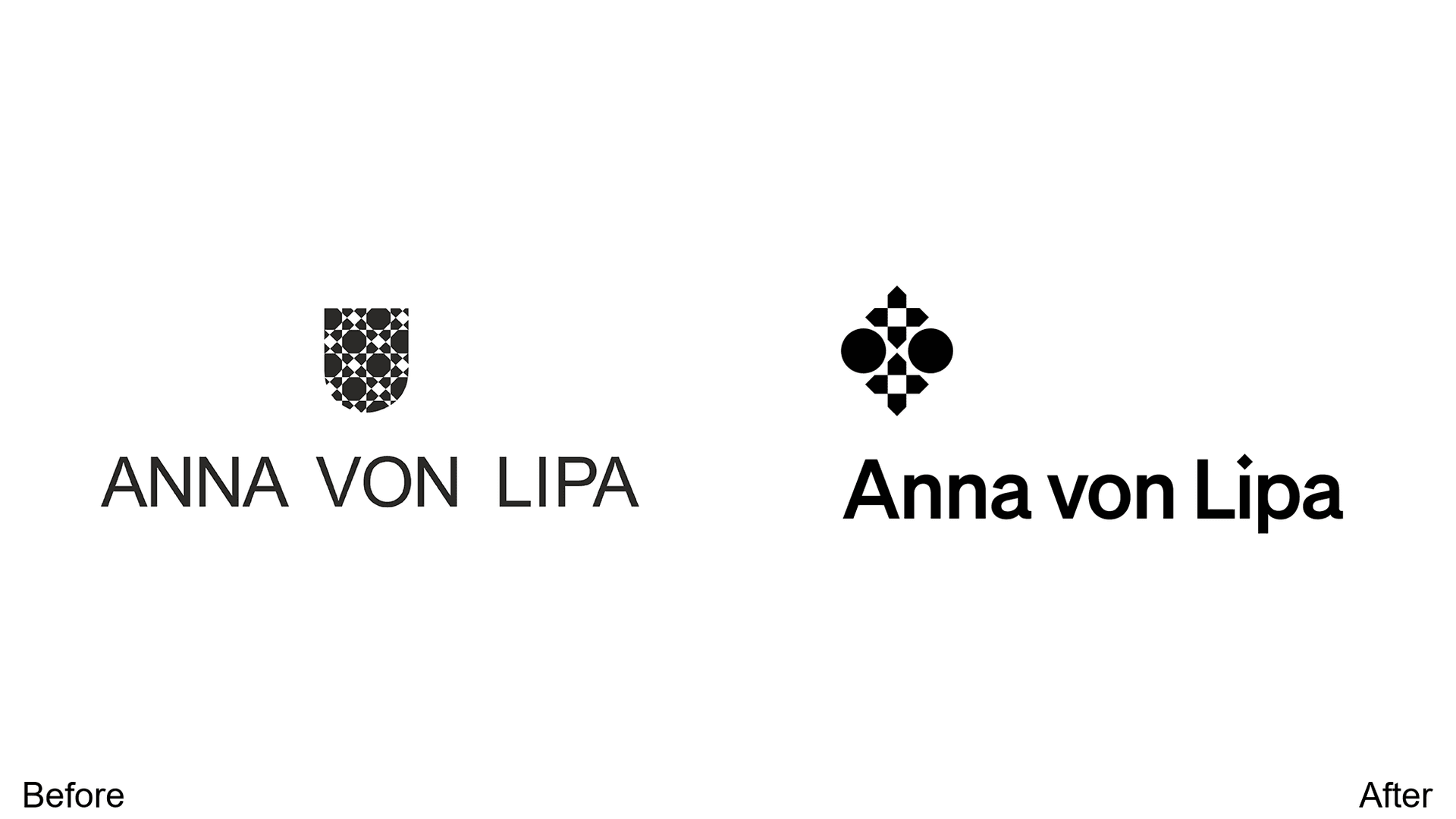
The Danish glassware brand boldened its logo for impact while simplifying the design for multi-platform printing. The unconventional alignment adds artistic flair that matches the brand's handcrafted aesthetic.
3. Famous Amos
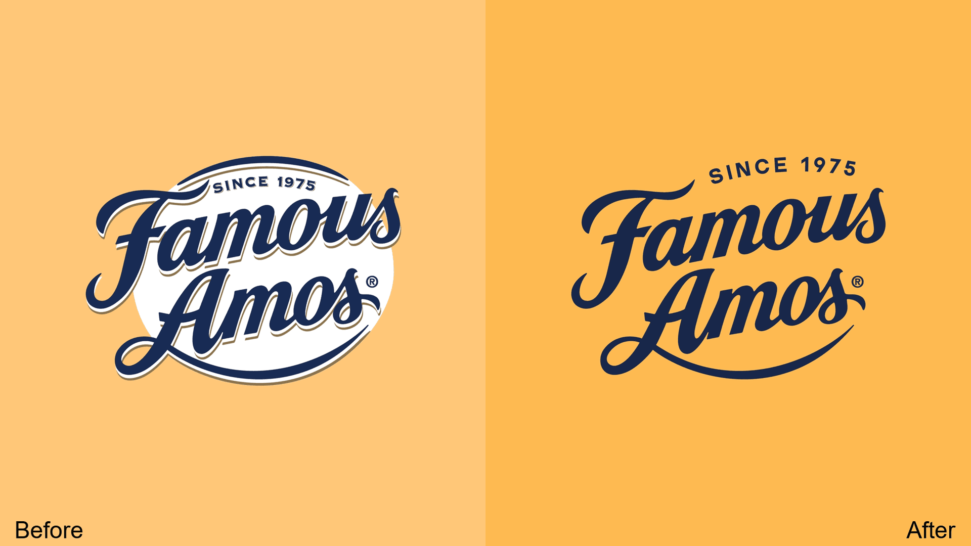
Shading and white background framing are gone. The result is better mobile and small-packaging compatibility while balancing nostalgia with modernity—exactly what a legacy cookie brand needs.
4. Kolding School of Design
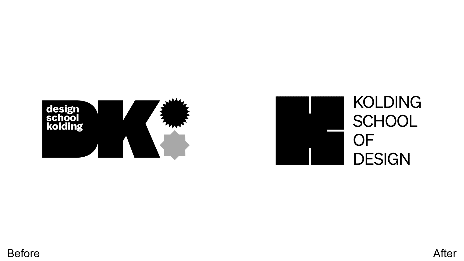
Excess shapes removed, replaced with a unique K letter logo. The balanced, blocky, brutalist aesthetic fits perfectly for a design school that wants to project confident creativity.
5. Benefit Cosmetics
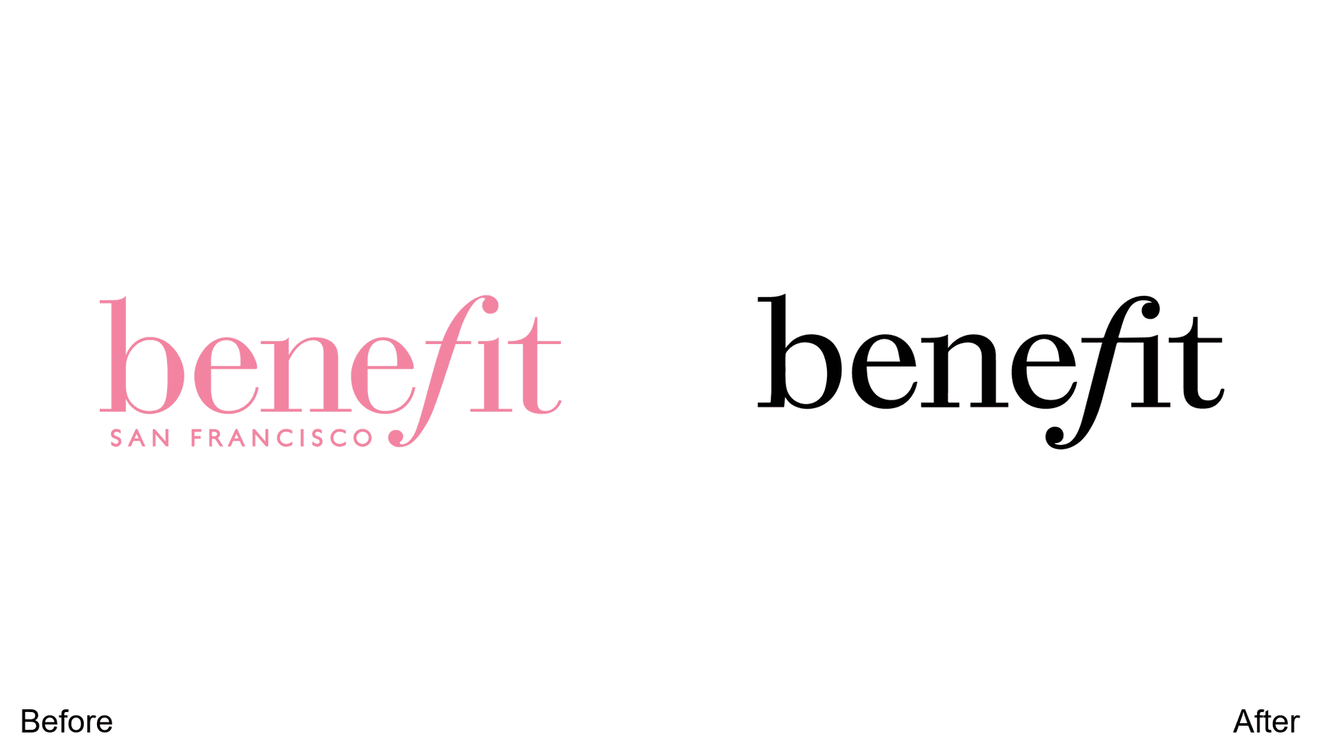
The "San Francisco" founding city reference is gone—smart for global appeal. The shift from pale pink to a more mature, gender-neutral color palette signals the brand's evolution.
6. Korean Air
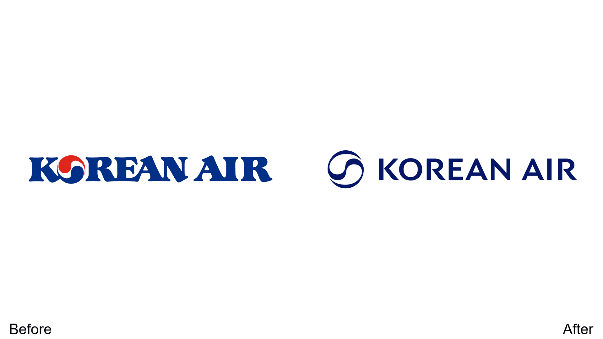
Monochrome and sans-serif for minimalism. The Korean taeguk motif moves left to preserve brand name readability—a classic "simplify but keep the equity" move.
7. ResMed
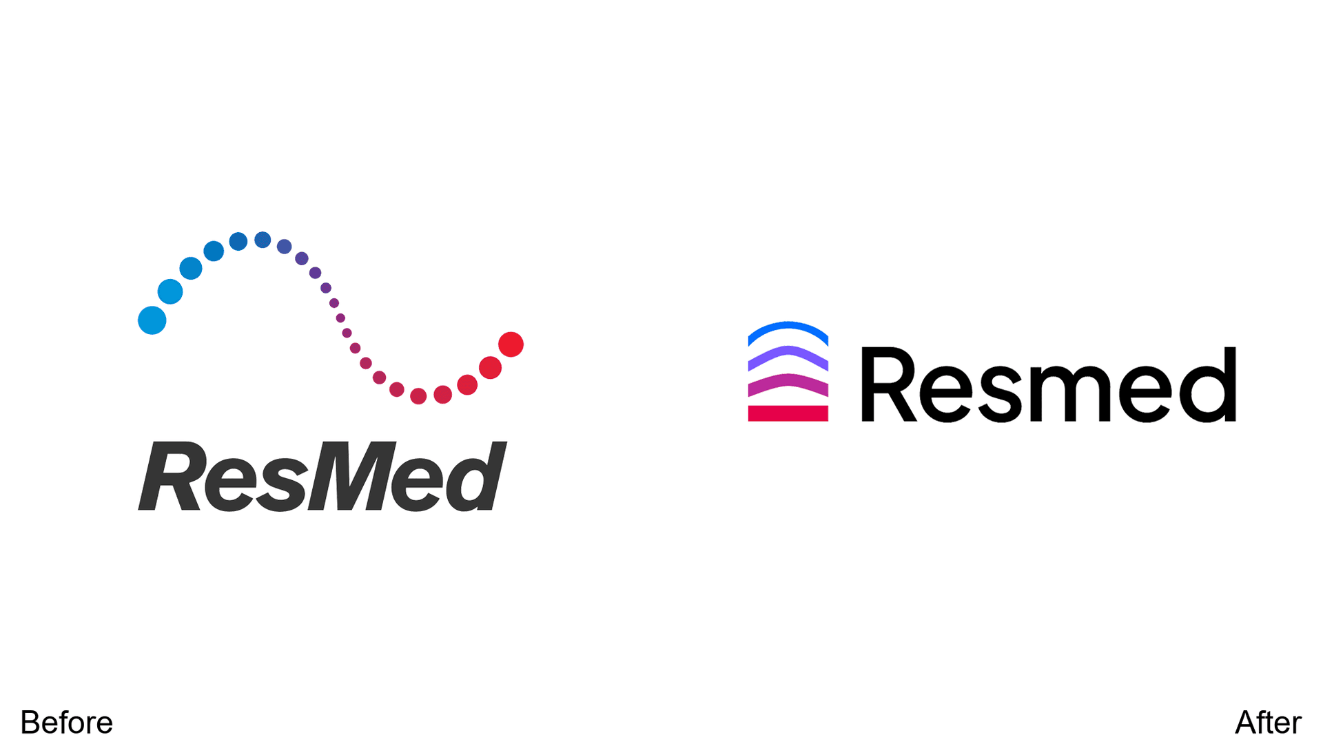
The difficult-to-see dotted design is simplified while maintaining the trademark color gradient. Sleeker and more visible—critical for a healthcare brand.
8. Humane World for Animals
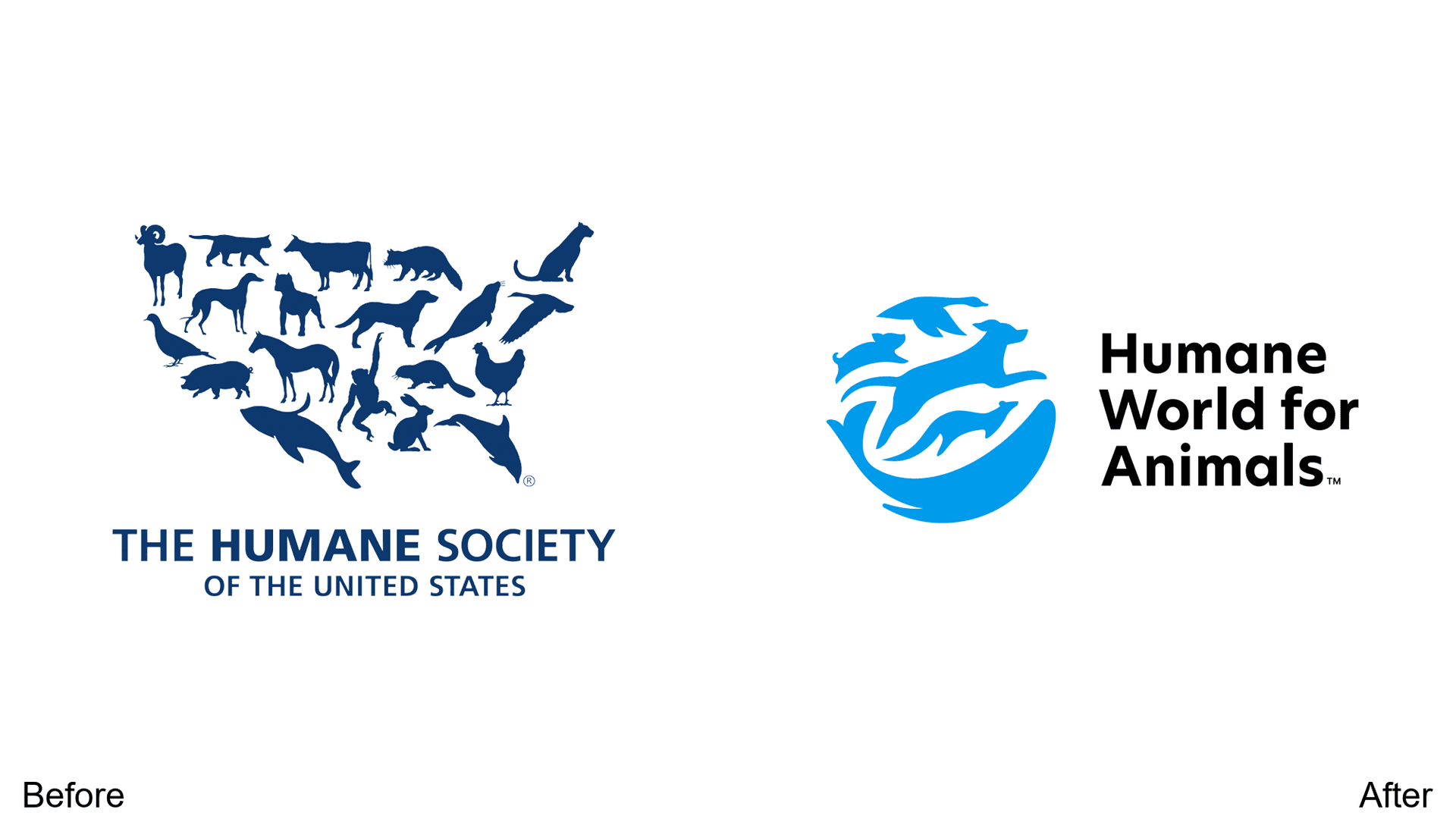
Geographic reference removed for international positioning. Brighter colors increase contrast between the animal motif and text, making the logo more readable at any size.
9. Toca Boca
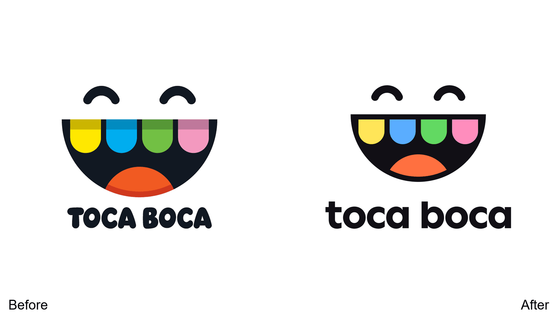
The iconic smiling motif stays, but shading is removed and the font becomes more elegant. Still colorful, but more sophisticated—the brand is growing up with its audience.
10. Apollo.io
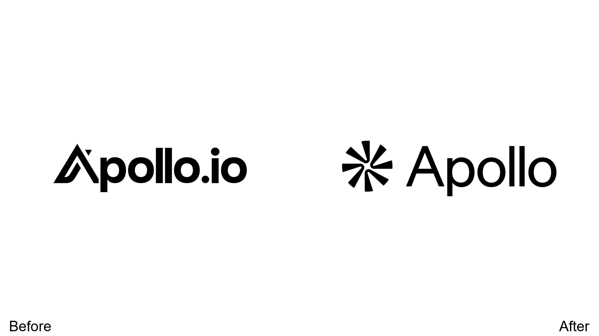
The artistic A is replaced with a crystal-clear sans-serif font. A simple logomark is added for improved small-application applicability—essential for a B2B software company.
11. Eventbrite
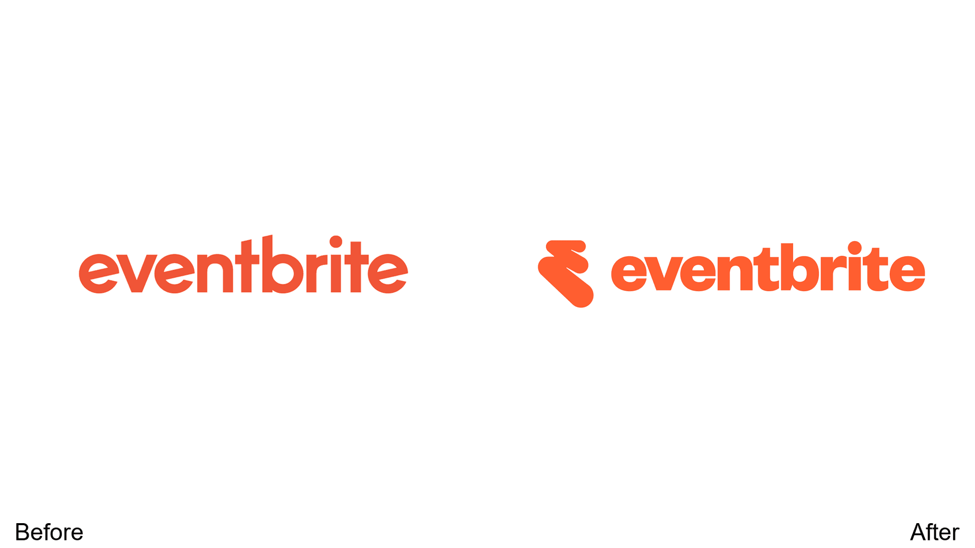
A new icon adds versatility across marketing materials. The shift from rounded, playful font to classical typeface signals maturity without losing approachability.
12. BBC Radio 1
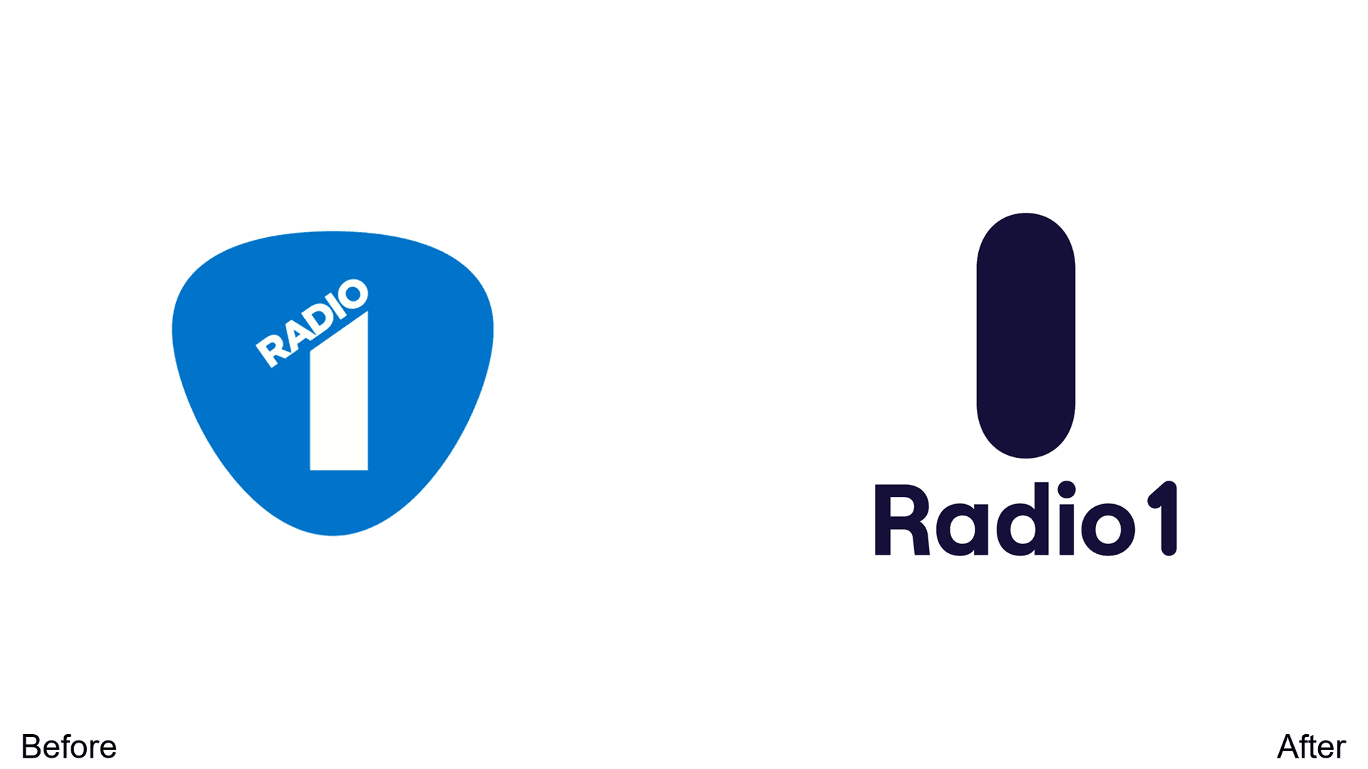
Fixed a readability issue where the "1" was split. The motif evolves from guitar pick shape to a singular oval representing the number—cleaner and more instantly recognizable.
13. Grok
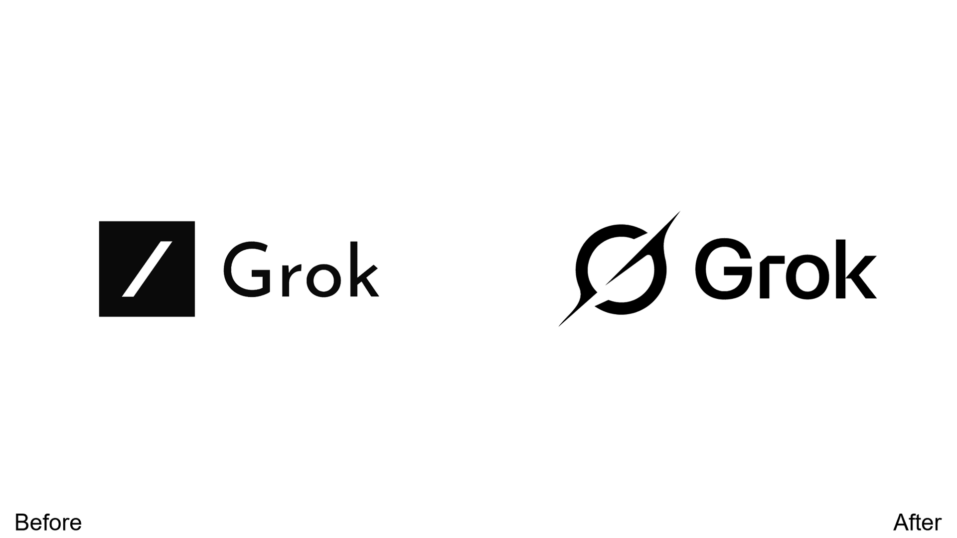
A dynamic logo with a slash cutting across the circle. Better symbolizes speed and exploration—aligned with xAI's cutting-edge positioning.
14. WTA (Women's Tennis Association)
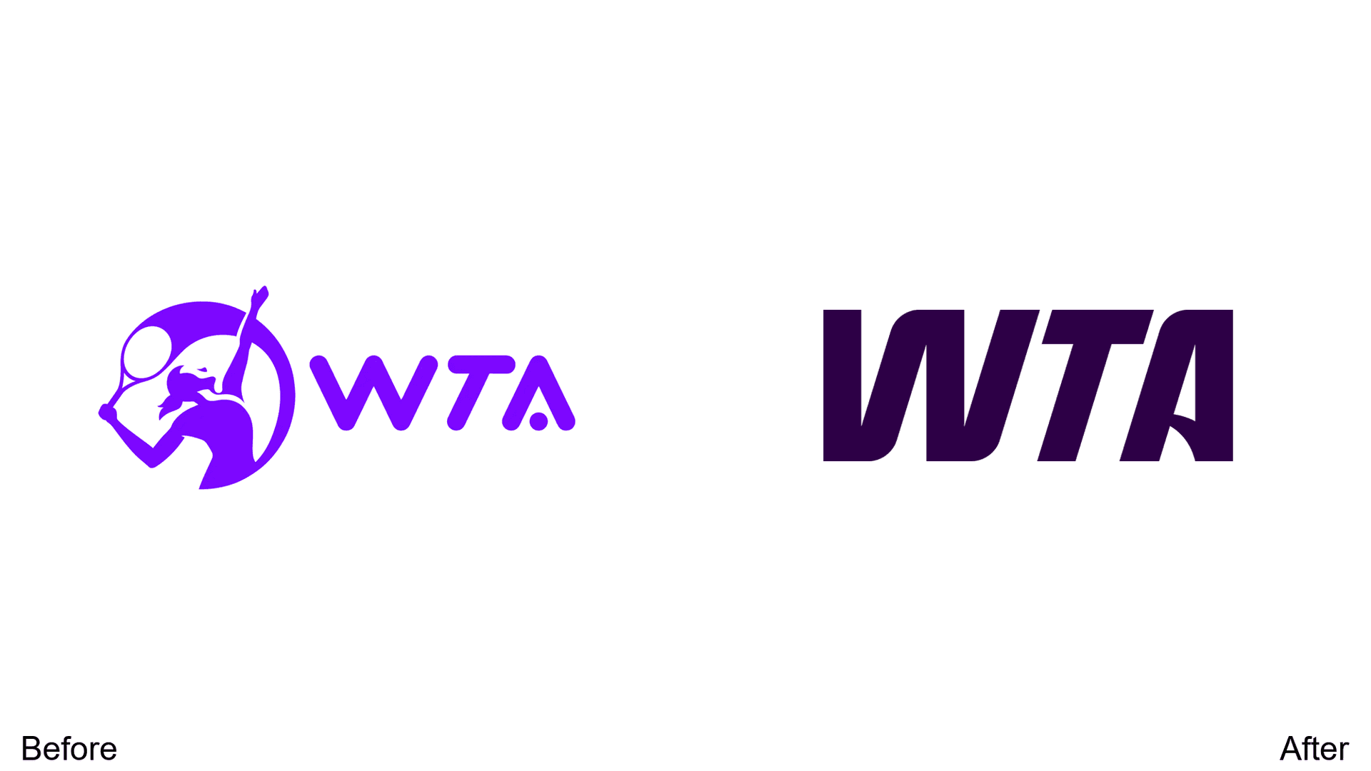
The complicated female swinging form is removed in favor of simplified text. Darkened purple introduces elegance and sophistication—a more premium sports brand feel.
15. Green Party of Canada
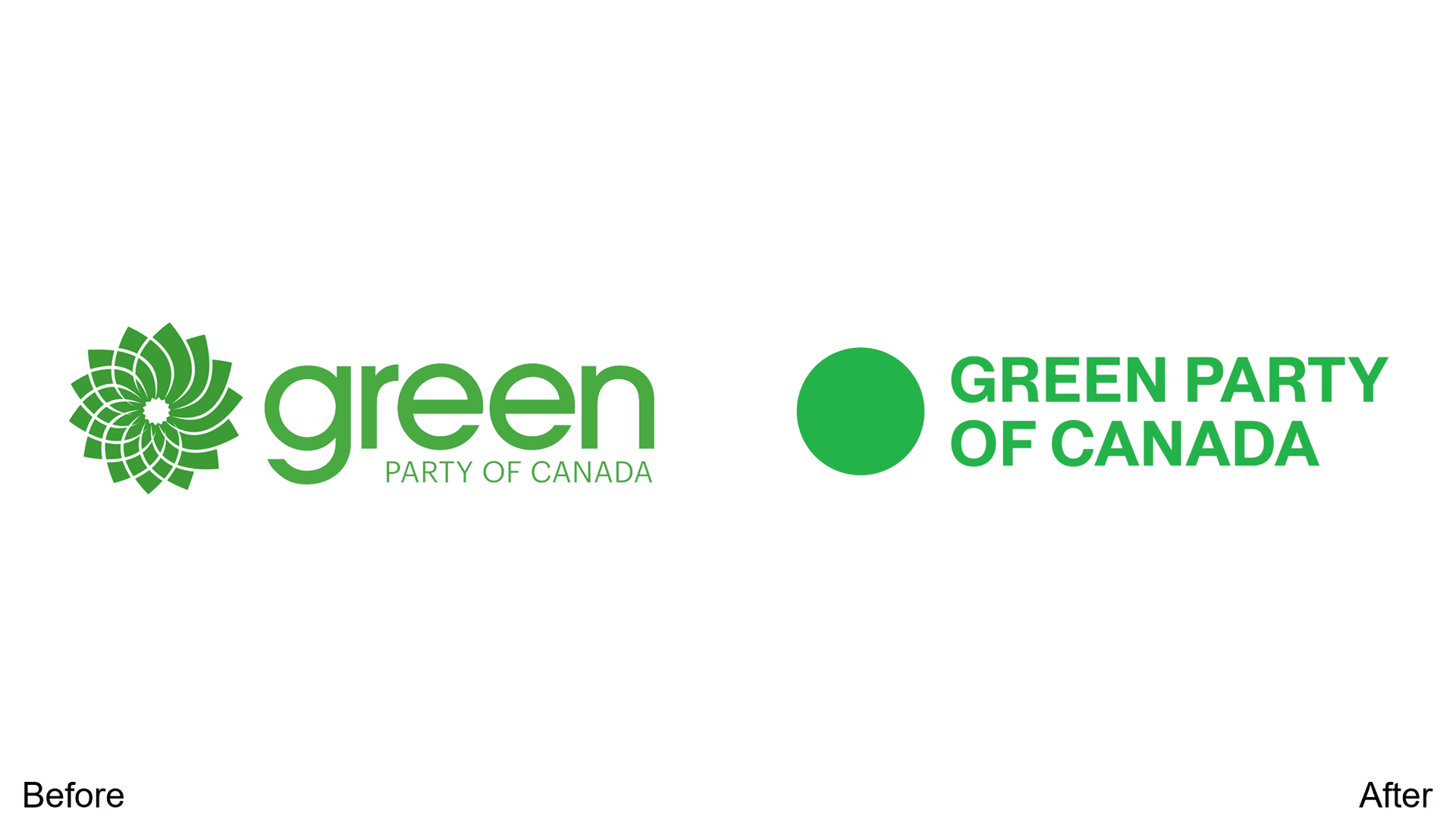
Green flower logomark replaced with a simple circle. Varying fonts consolidated into bolded, all-caps sans-serif stacked design—more cohesive and modern.
16. OpenAI
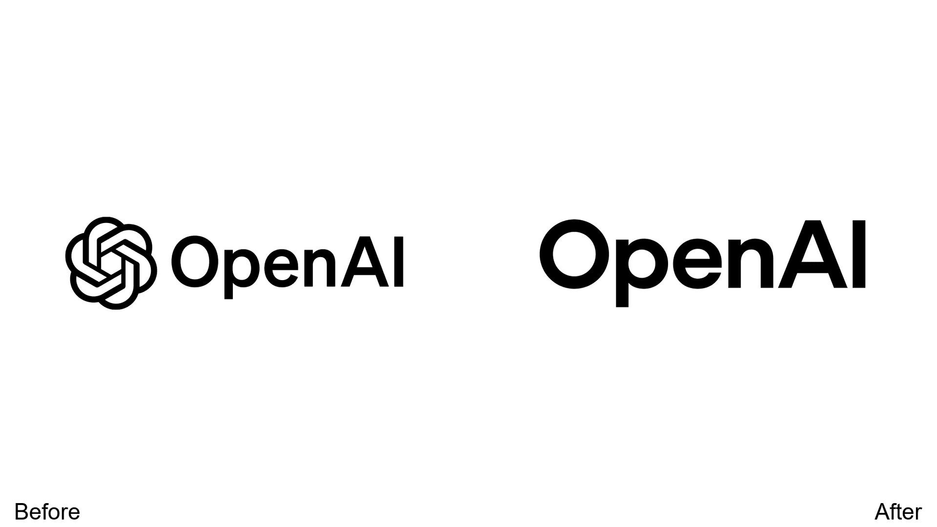
Custom-designed OpenAI Sans font implemented. The circular blossom logo remains, but the wordmark will feature more prominently—building brand recognition beyond the symbol.
17. Alpen
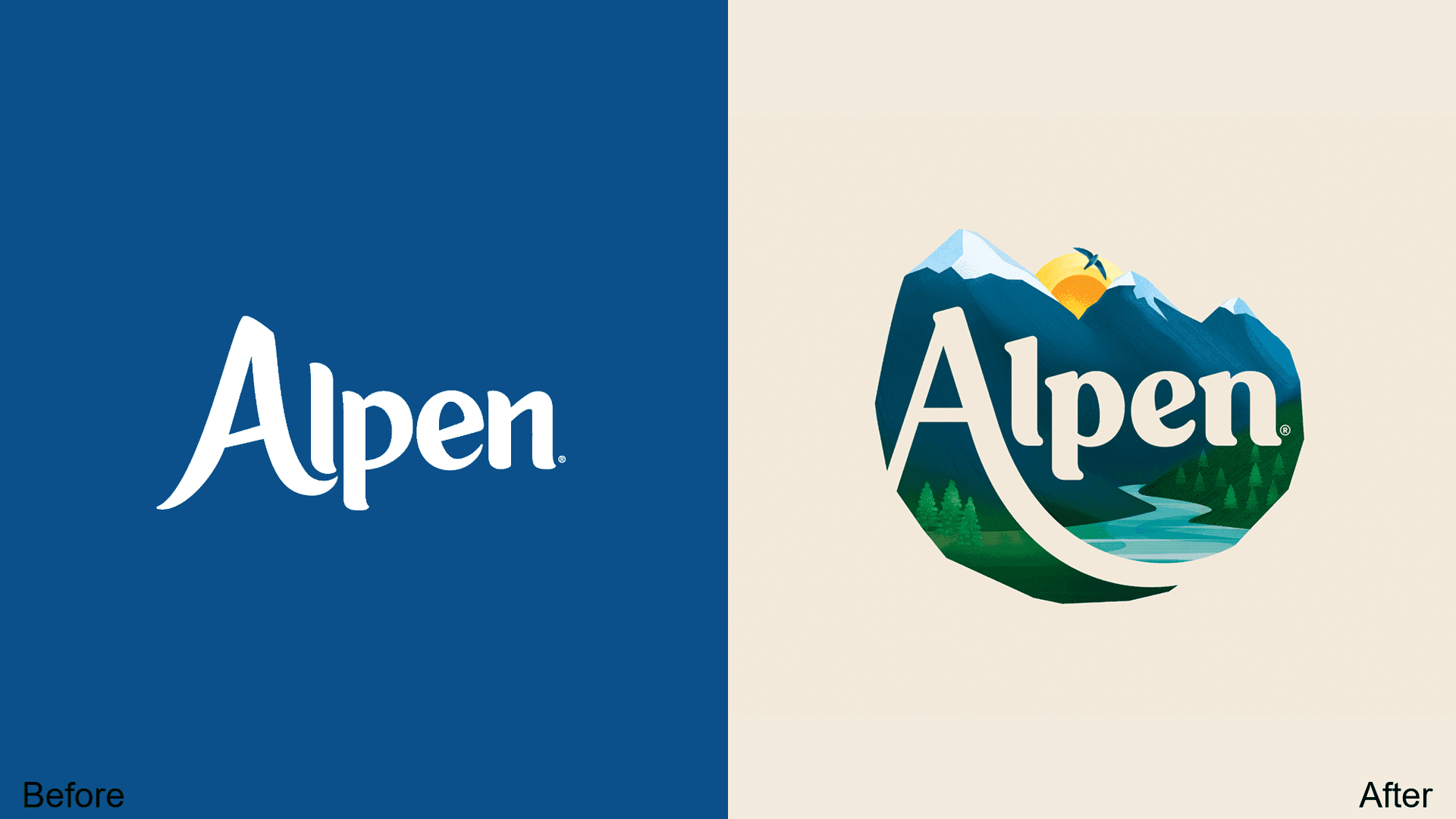
A shift from simple lettering to a detailed design featuring mountains, river, greenery, and sun. Strengthens the nature connection for this muesli brand—more illustration, more story.
18. HSA Bank
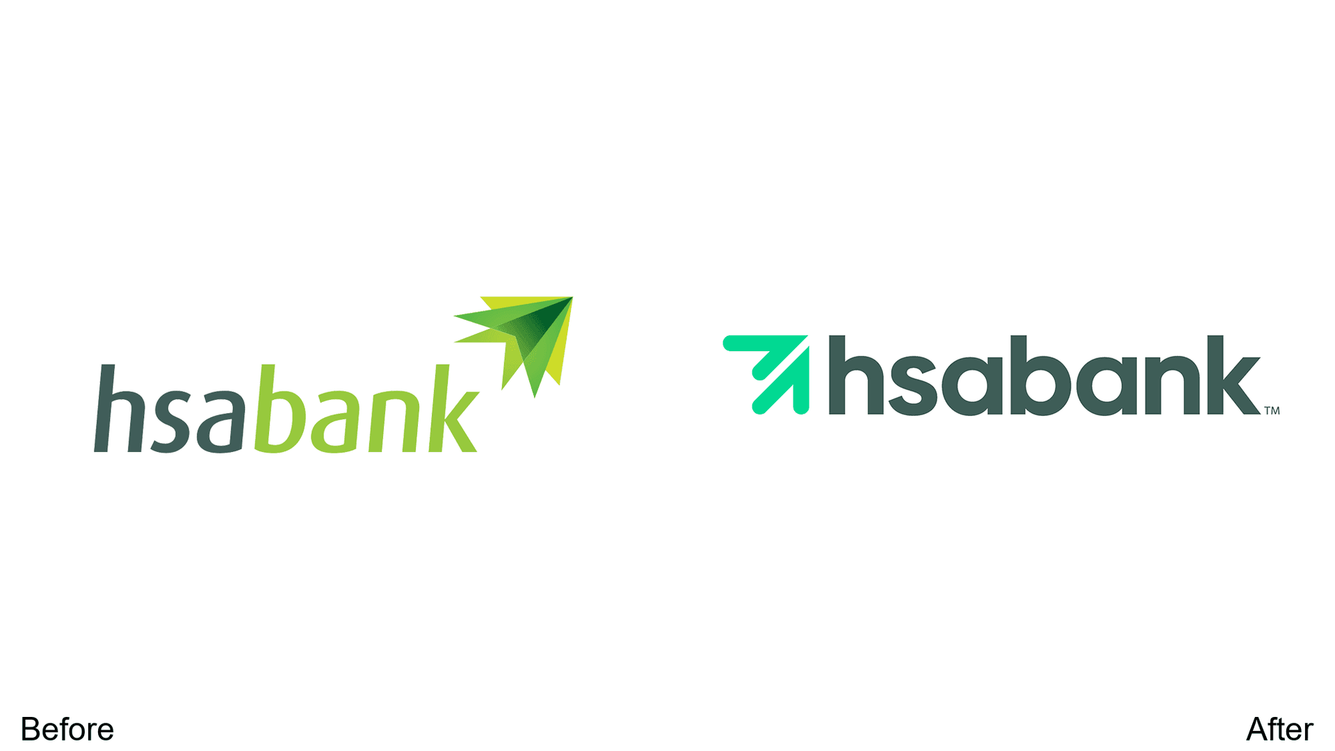
Simplified color palette with bold, rounded lettering in darker, muted tones. Enhanced credibility and future-ready perception—exactly what a financial brand needs.
19. Otur
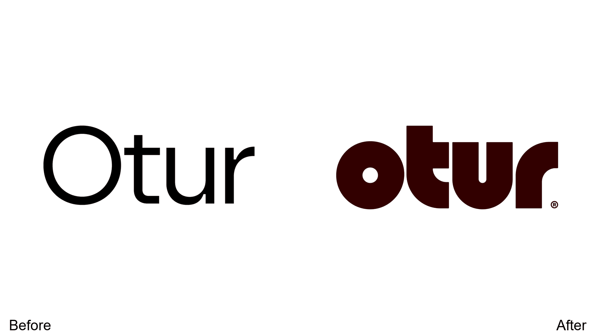
A unique thick retro font with dark brown tone creates a more artistic, homey aesthetic for this designer lamp brand. Typography as brand personality.
20. Brazil Olympic Team
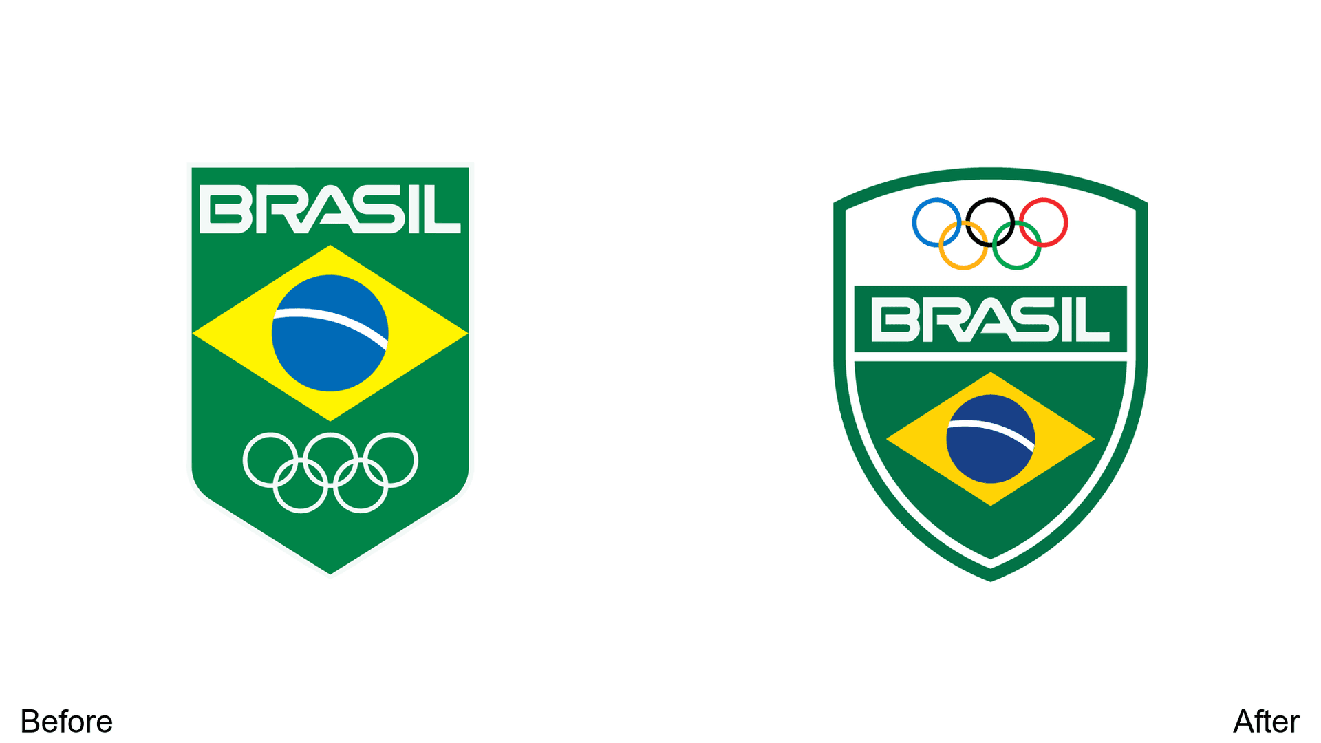
Evolution from sharp-edged banner to rounded shield shape. Olympic ring colors reintroduced, emphasizing unity, approachability, and inclusivity.
21. Up&Up (Target)
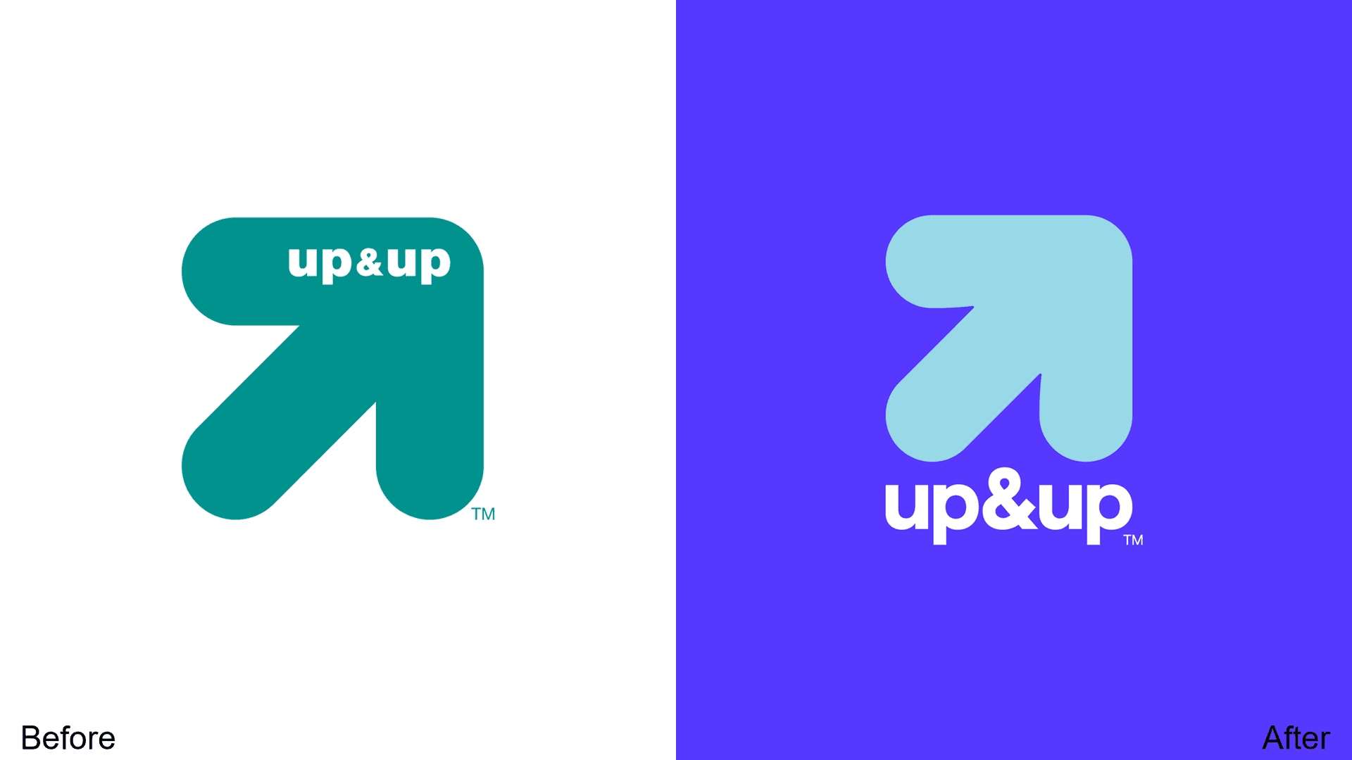
Target's private label brand gets refreshed with vibrant indigo. Text more prominent with thinner font and larger ampersand—improved contrast and shelf presence.
22. Pixiv
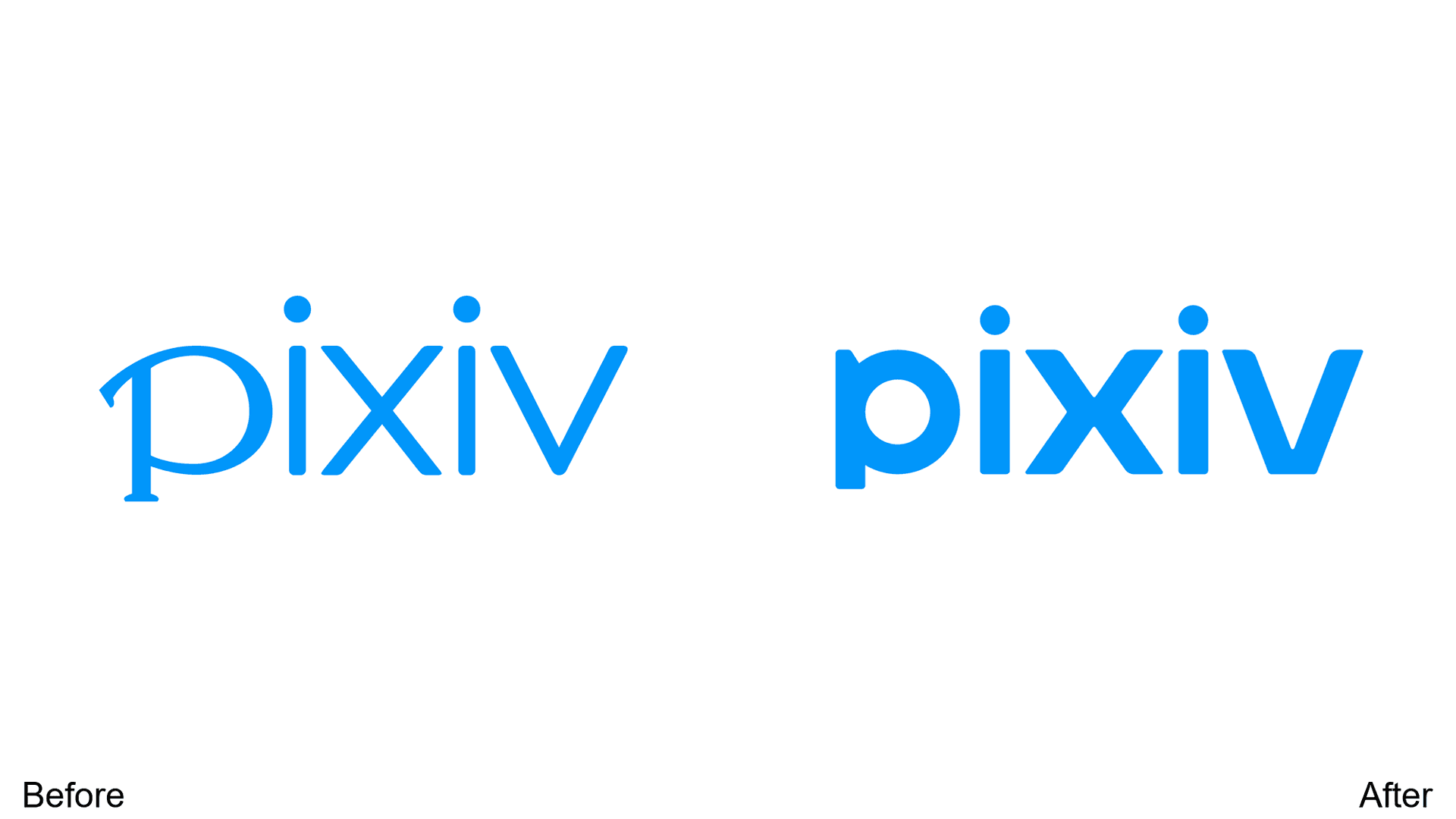
First redesign since 2008. Clean sans-serif with thicker, bolder lines. The Japanese art platform preserves core identity while finally modernizing.
23. GF Smith
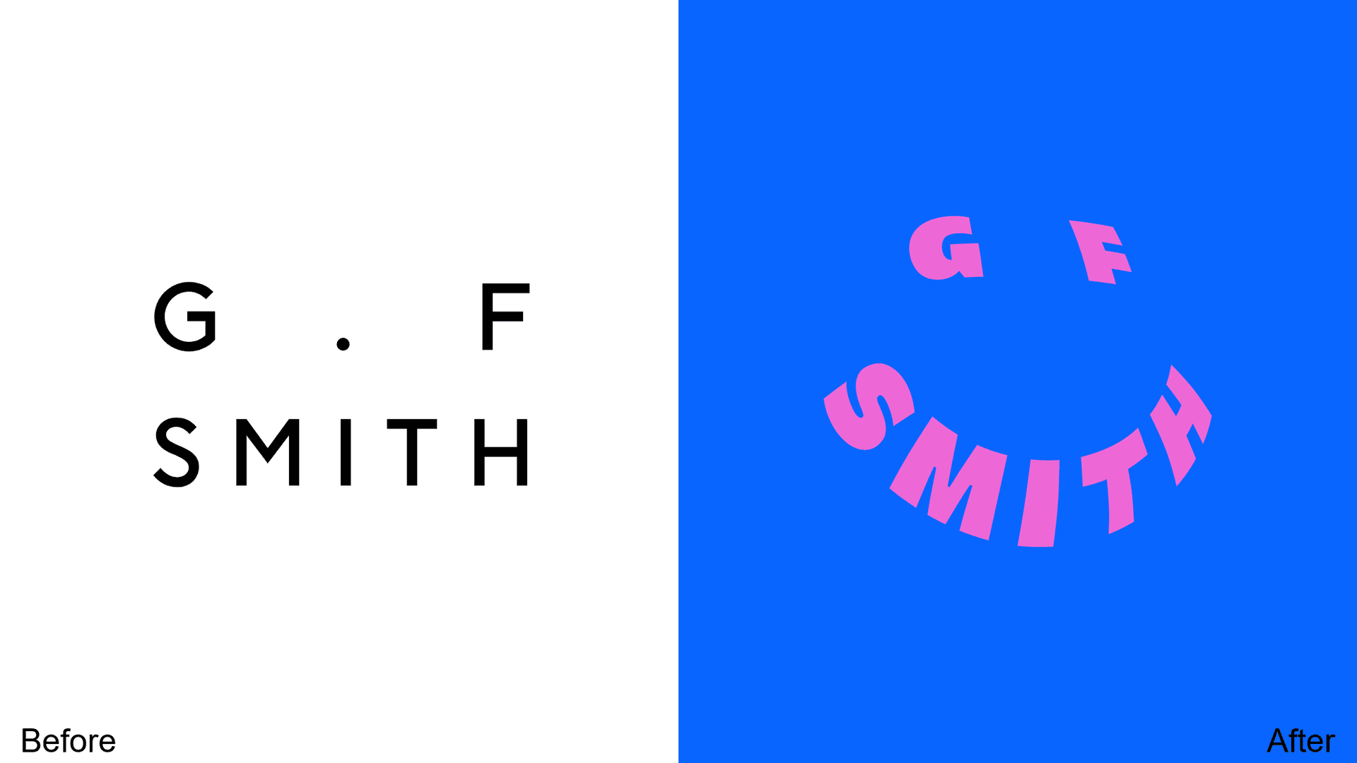
A radical transformation: classic minimalist wordmark replaced with a vibrant smiley-faced logo. Targeting Gen Z, but risking alienation of established customers. Bold gamble.
24. Cinemex
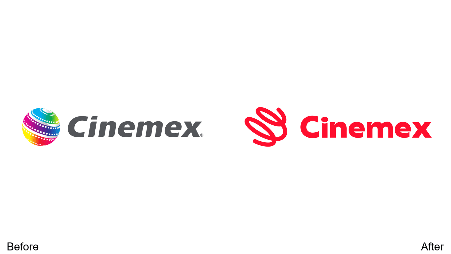
Color palette cleaned to bold red. The film orb simplified from complex gradients to a singular line—enhanced visibility across screen sizes for the Mexican cinema chain.
25. US Department of Energy
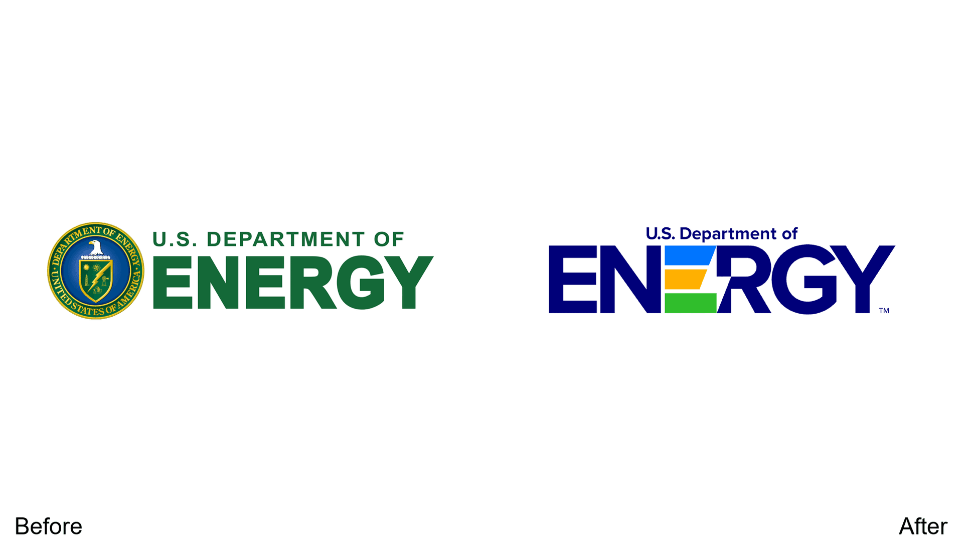
Nearly invisible eagle crest and shield details removed. The middle "E" now highlighted in signature colors for greater impact and recognition—government branding that actually works.
26. Perkins Restaurant & Bakery
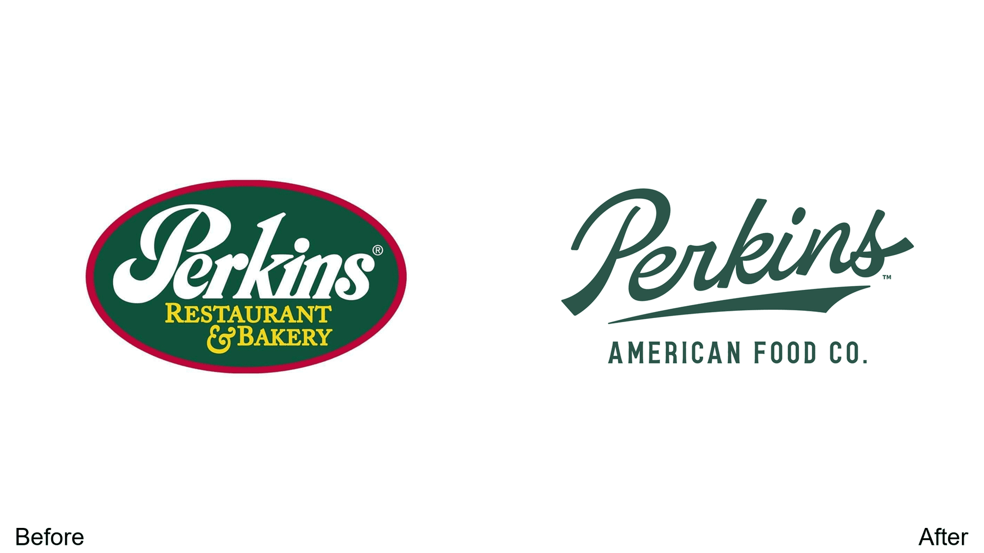
Red border removed, hometown vibes traded for international appeal. The shift to complex cursive font adds sophistication to the family restaurant brand.
27. Transamerica
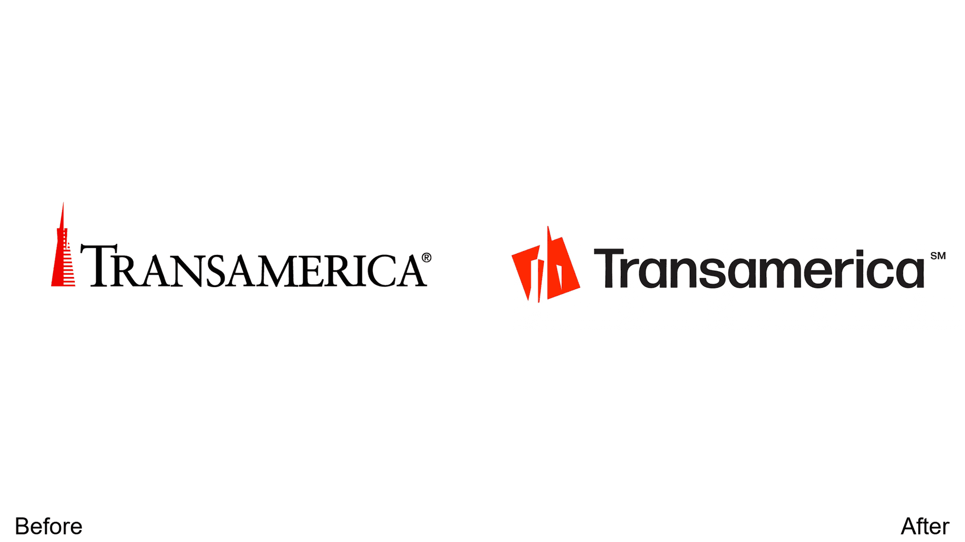
Old-fashioned serif becomes sleeker sans-serif. More blocky, high-contrast design replaces the thin tower lines—modernizing without losing the iconic pyramid reference.
28. Fairphone
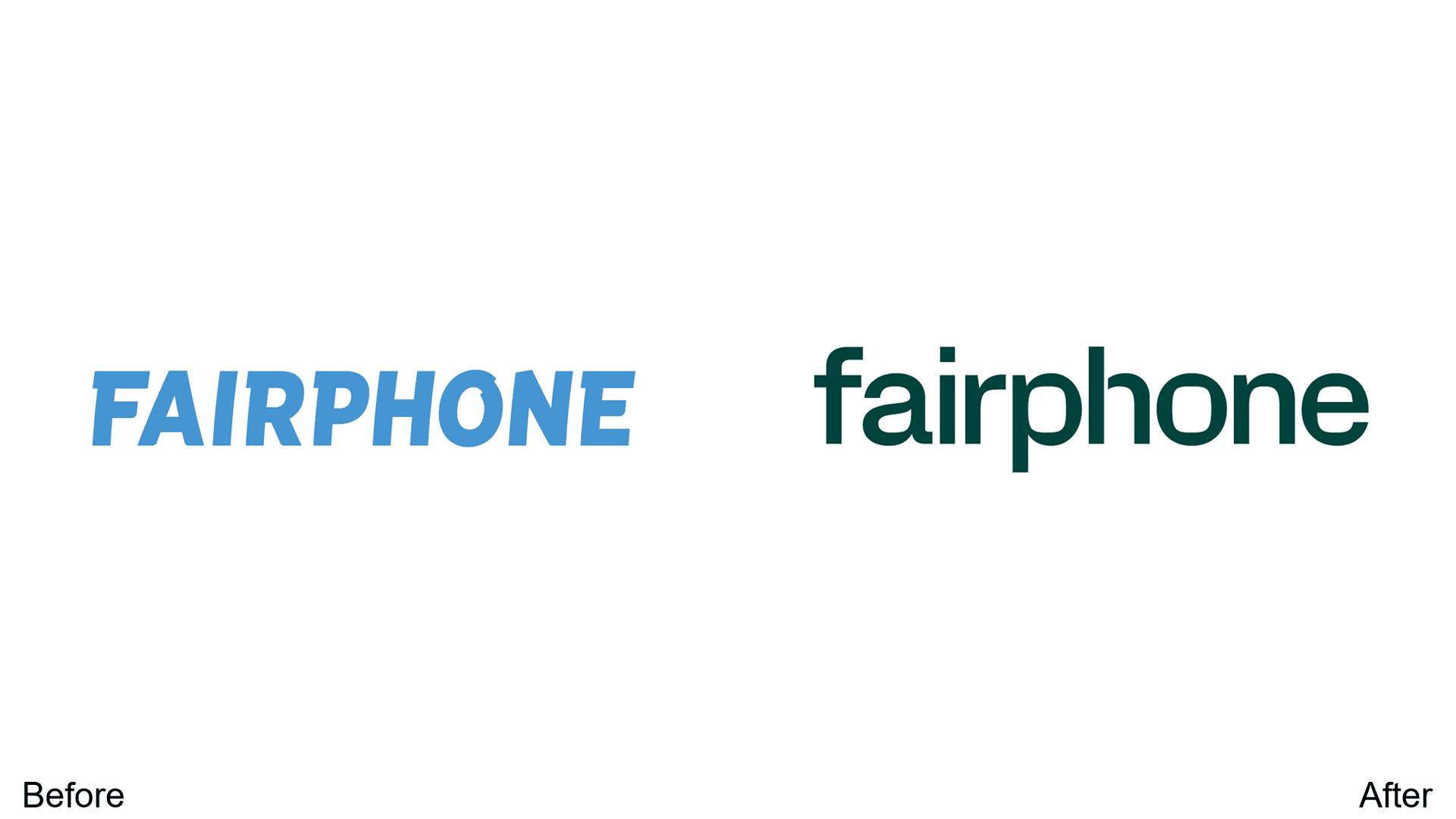
Dark green tone aligns with sustainability messaging. Modern, clean, approachable lowercase font signals simplicity—perfect for an ethical electronics brand.
29. Asian Football Confederation (AFC)
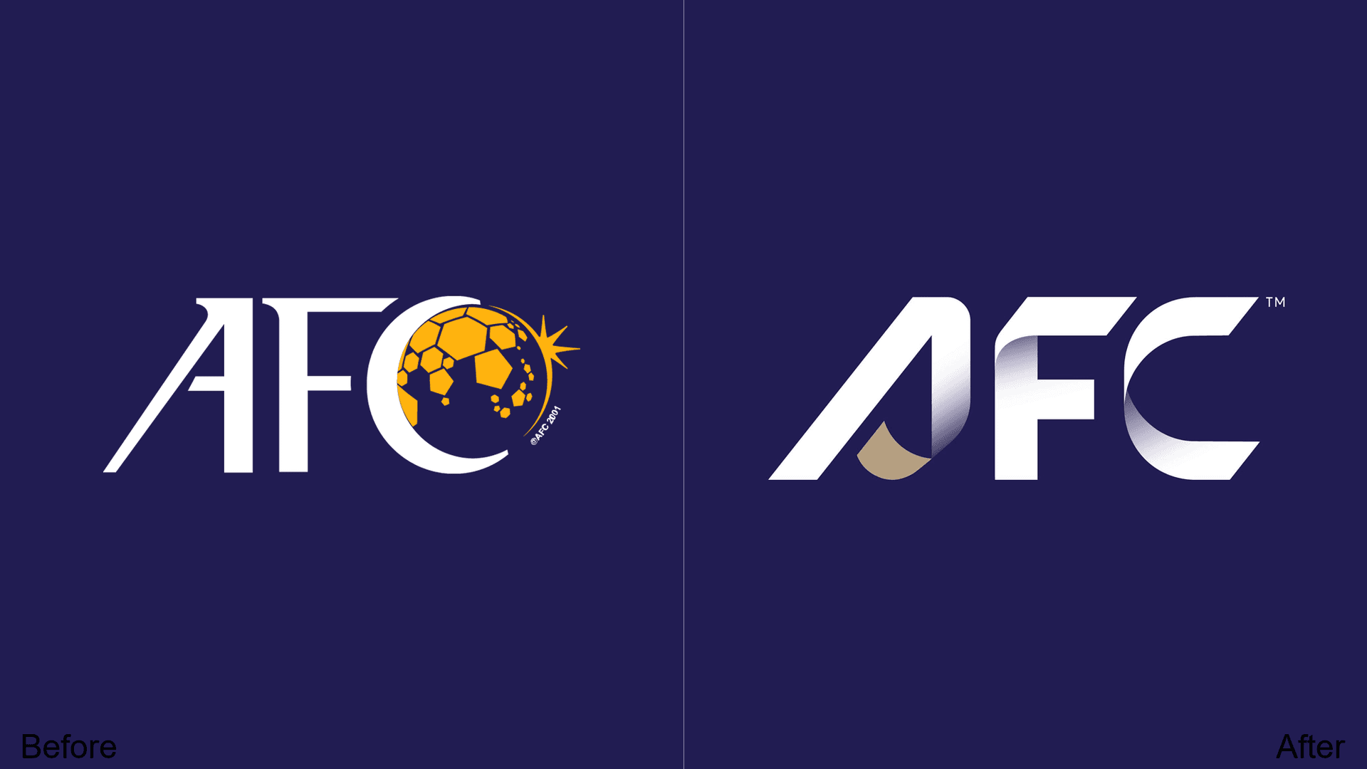
Soccer ball and star details removed. The focus shifts purely to the brand name for improved recognizability across media—less interesting, but more functional.
30. Radisson
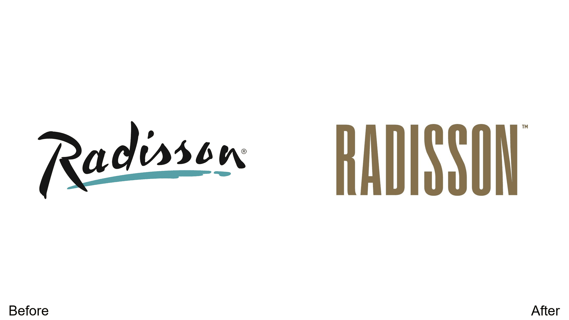
Classic design becomes bronze-like shade with sleek, skinny sans-serif font. Enhanced luxury perception and international accessibility—upmarket positioning for the hotel chain.
The Patterns Worth Noting
Looking across these 30 redesigns, a few trends emerge:
- Simplification dominates. Nearly every redesign removes elements rather than adding them. Details that looked impressive in 2015 look cluttered in 2025.
- Geographic references are disappearing. Brands are dropping city and country mentions to position themselves as global players.
- Sans-serif is winning. The shift from serif to sans-serif continues, driven by screen-first design requirements.
- Color palettes are getting bolder or more muted—rarely staying the same. Either commit to vibrance or commit to sophistication.
- Wordmarks are reclaiming space. Several brands are moving from symbol-heavy to text-forward identities, betting that the name itself is the strongest asset.
The best redesigns on this list share one quality: they solve a real problem. Whether it's scaling issues, outdated aesthetics, or positioning shifts, the logos that work are the ones that had a clear reason to change—and changed only what needed changing.


